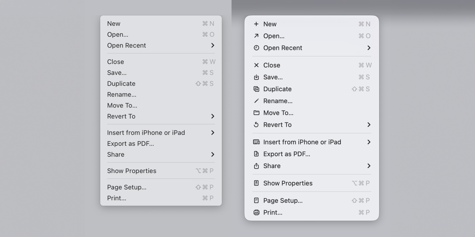
The menu icons in macOS 26 Tahoe were roundly criticized for being both ugly and making Macs harder to use. A software engineer pointed out that Apple warned against this very mistake in guidelines published way back in 1992, and the company is now reiterating that decades-old advice as developers get to try macOS 27 Golden Gate … 9to5Mac readers had mixed views on the app icons introduced as part of macOS 26 Tahoe, but there was a clear consensus that Apple’s introduction of icons for every menu option was a terrible idea. Indeed, one software engineer pointed out that Apple’s Macintosh human interface guidelines advised against this very mistake way back in 1992. The company described the practice as ugly, unpleasant, distracting, illegible, messy, cluttered, confusing, and frustrating. Apple has now corrected this mistake , and Nikita “Tonsky” Prokopov noted that the company’s very latest guidelines reiterate this advice. Use menu item icons sparingly and with purpose.…