(Image credit: Airbnb)
Rebrand Revisited is a new series examining the brand redesigns that divided opinion, and asking whether history has been kinder to them than the comments section.
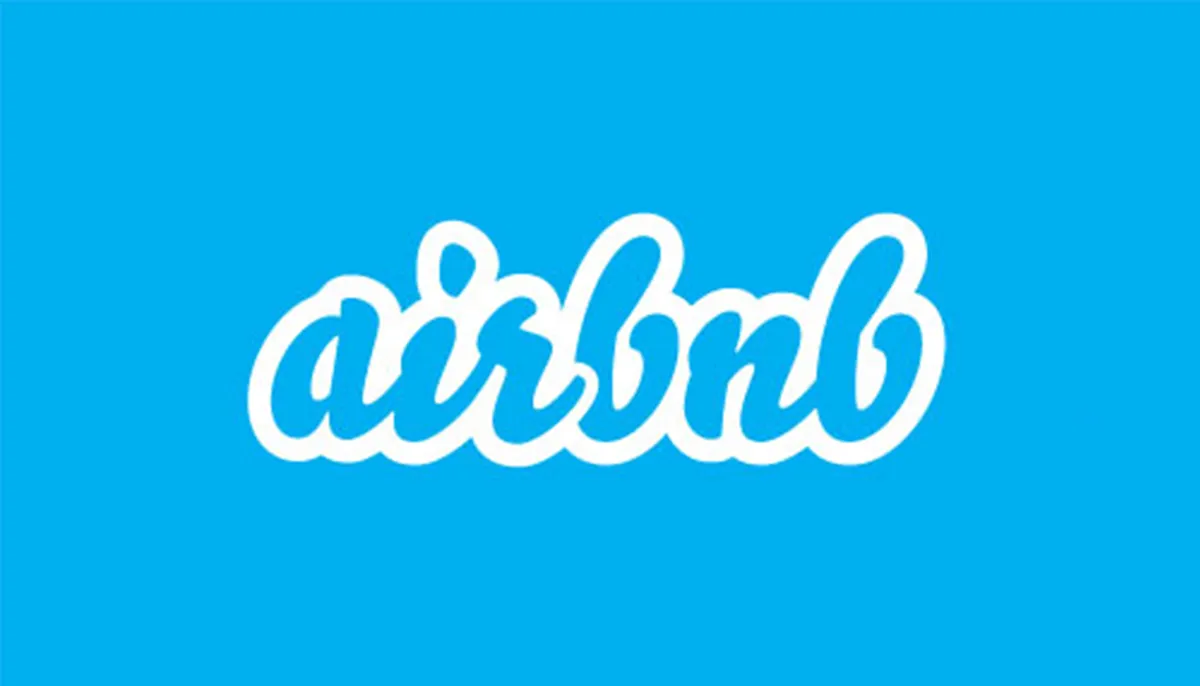
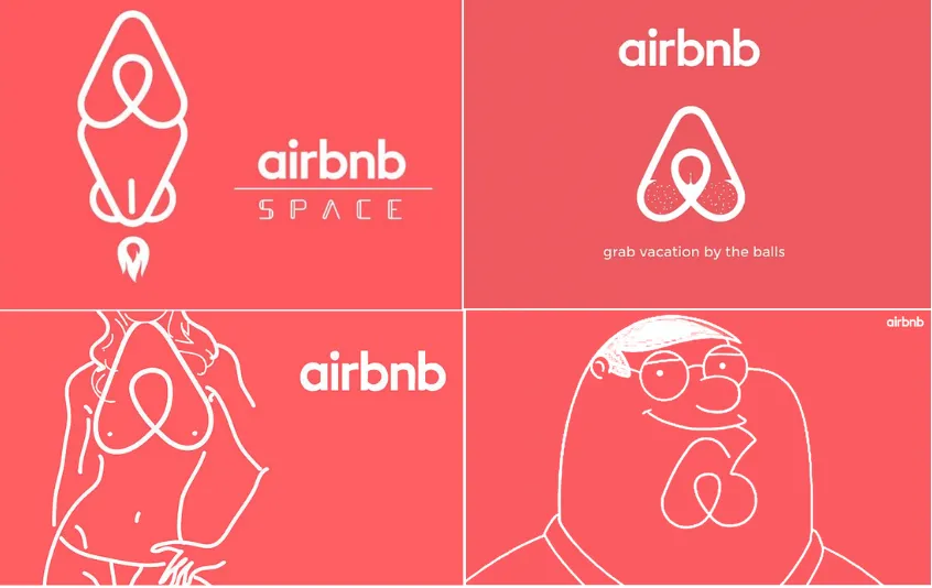
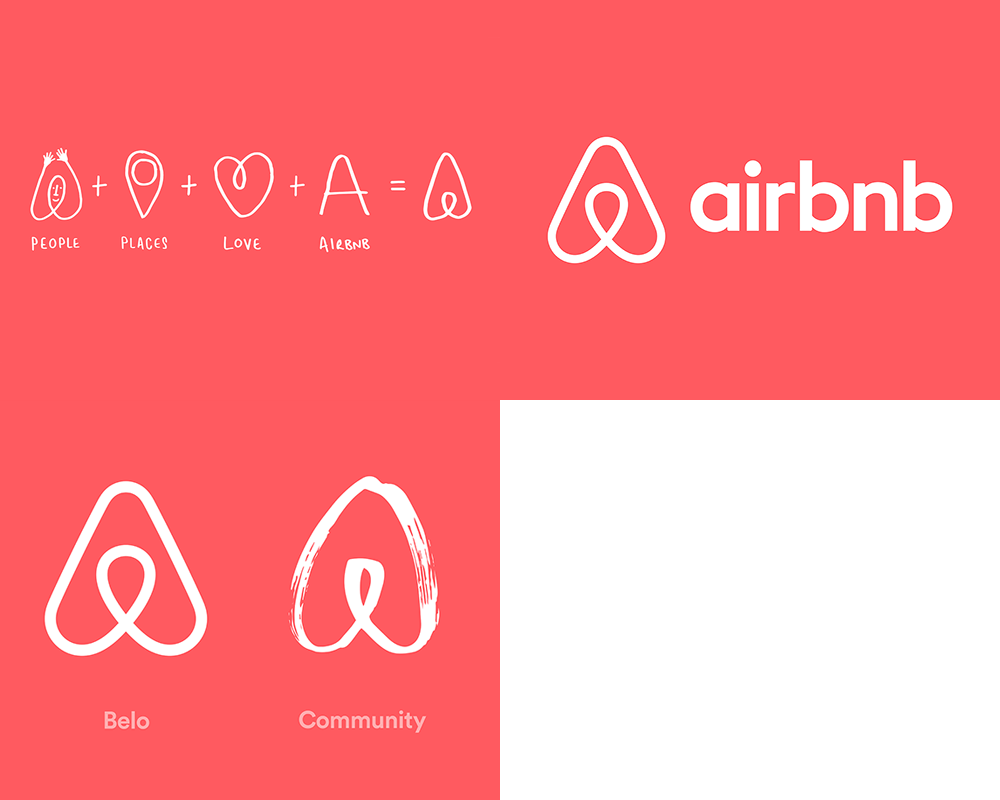
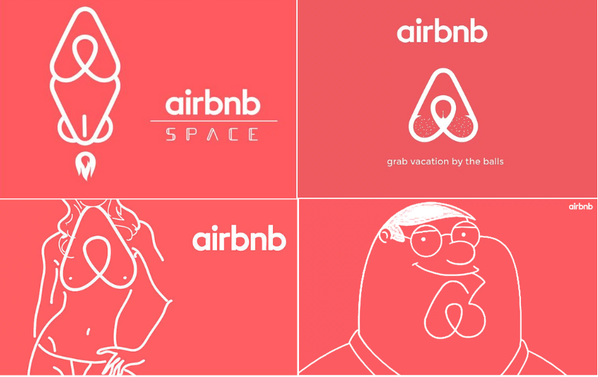
We all remember where we were when Airbnb revealed its new logo in 2014. Okay, maybe not. But it was certainly one of the biggest design stories of the year. The new logo was designed to represent "people, places, love and belonging". The internet promptly decided it looked like genitalia, leading to many thousands of social media posts and column inches. It probably wasn't quite the heartwarming response the company had in mind.
But skip forward twelve years, and the Bélo (as the symbol was officially named) is still going strong. Indeed, these days it's hard to imagine Airbnb without it. So how did a logo that launched to an avalanche of mockery and anatomical comparisons become one of the most recognisable symbols in travel?…