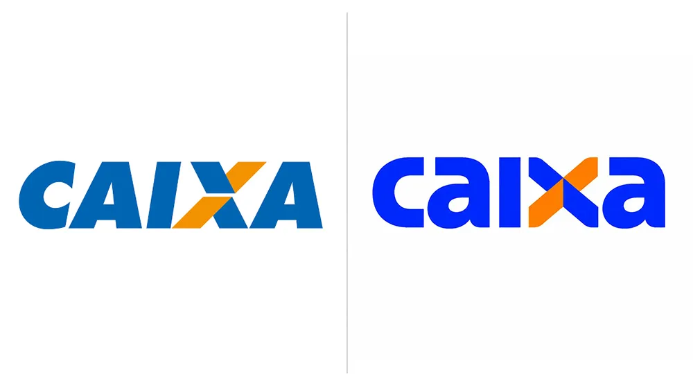
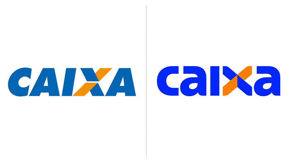
(Image credit: Caixa)
Banks don't always have the most exciting branding, but Brazil's Caixa Econômica Federal, a huge state-owned financial institution with 165 years of history, has a good go. The bank's rebranded for the first time in almost three decades, and the new identity ticks all the boxes.
The new identity is a fine example of a redesign done right. It feels more modern, more human and approachable, and it remains instantly recognisable, maintaining a clever hidden symbolism.
See our guides to the best laptops for graphic design and the best monitors for graphics artists if you need new tools for your own work.
The Caixa logo before and after the rebrand (Image credit: Caixa)
The Caixa rebrand was the work of the Brazilian agency Tátil.…