12 min read
CSS , UI , Web Design
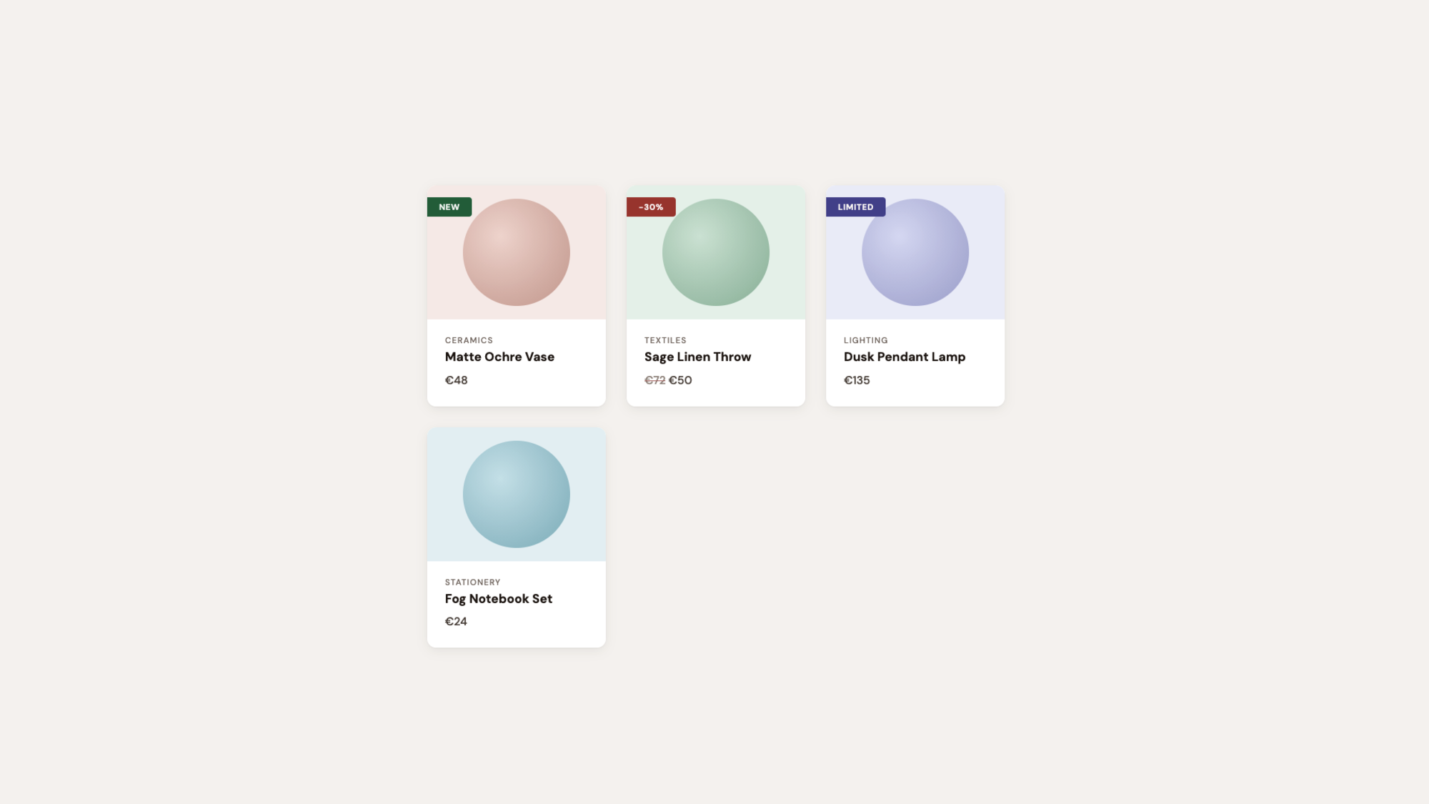
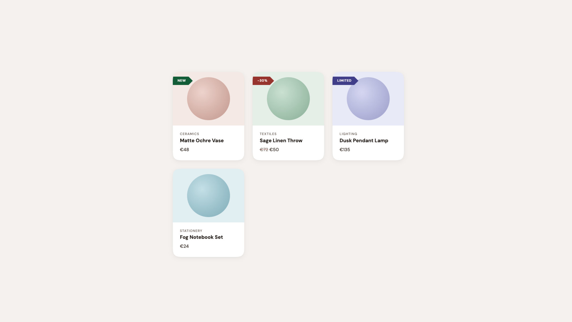
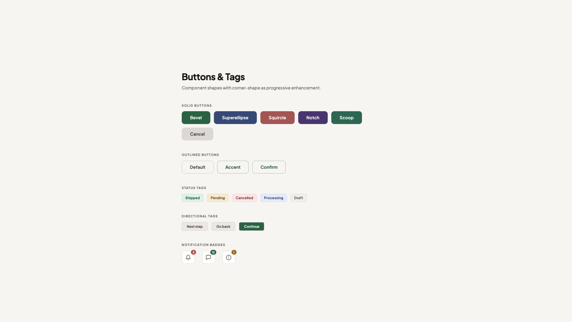
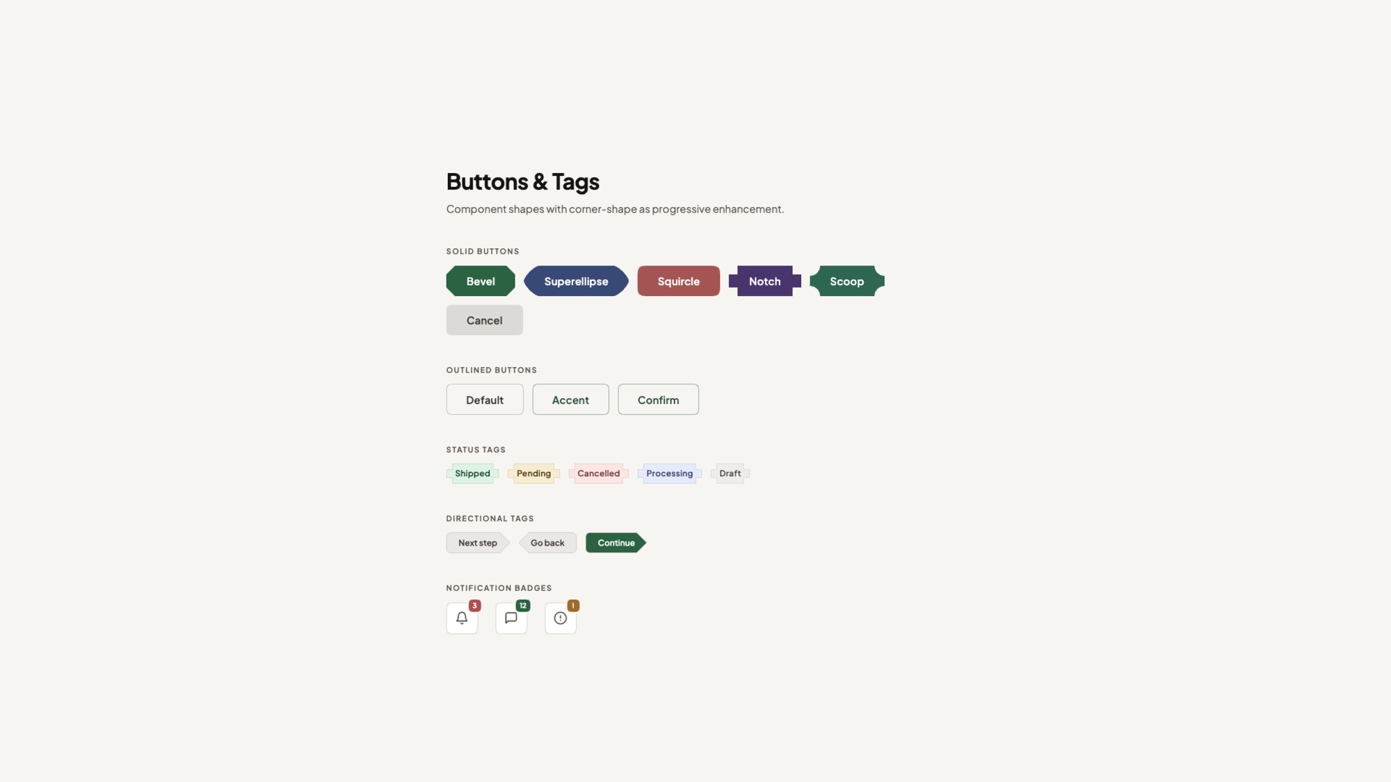
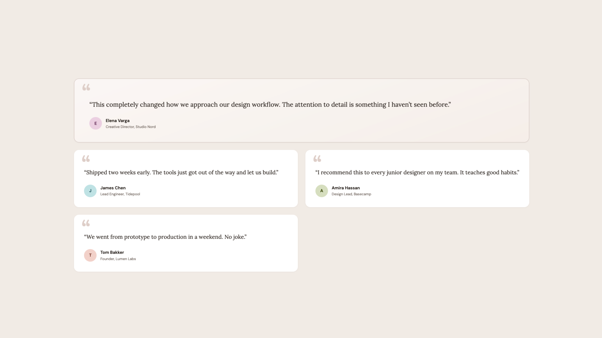
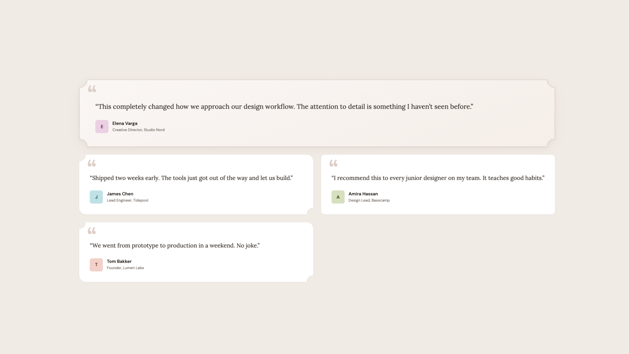
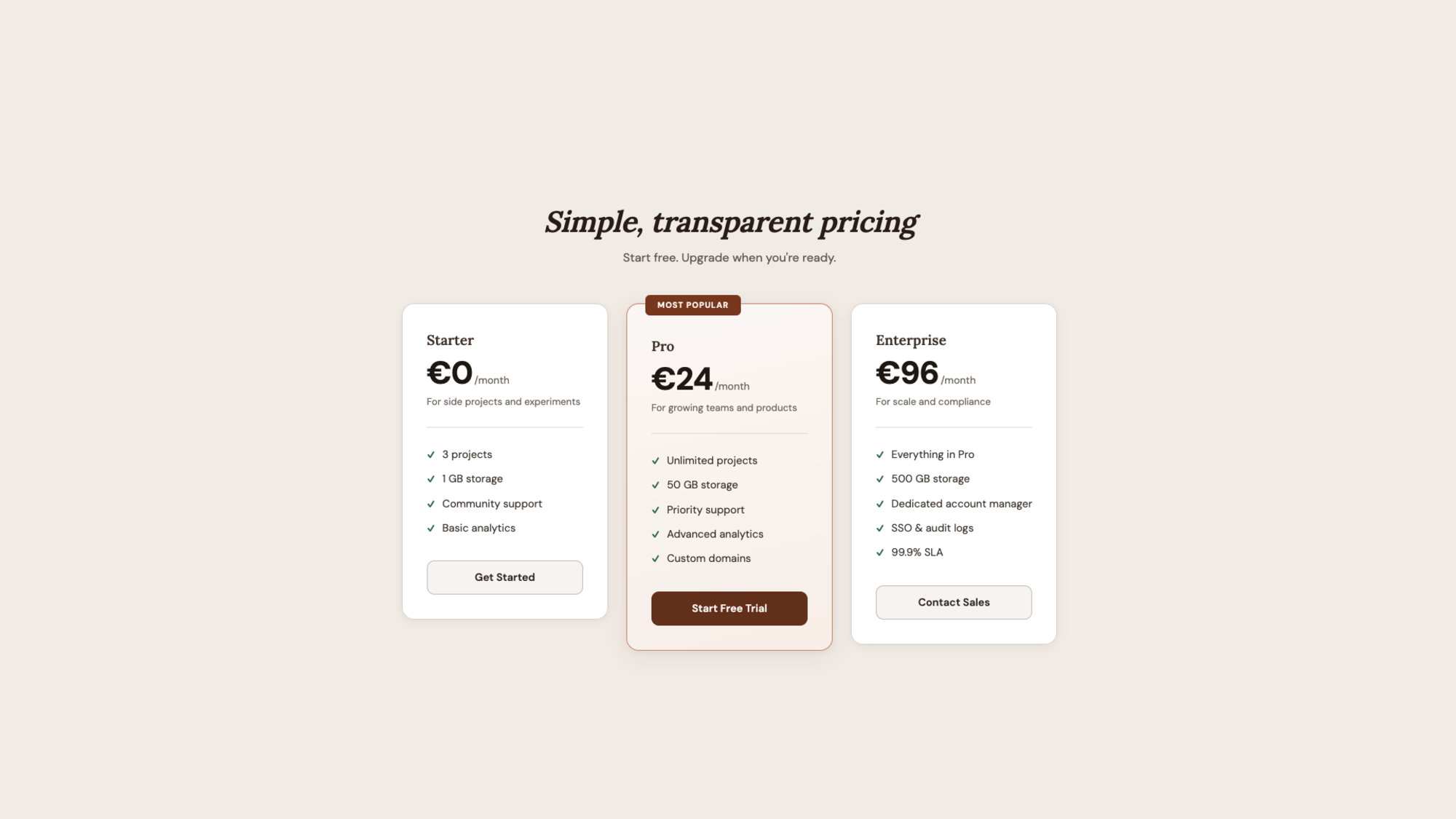
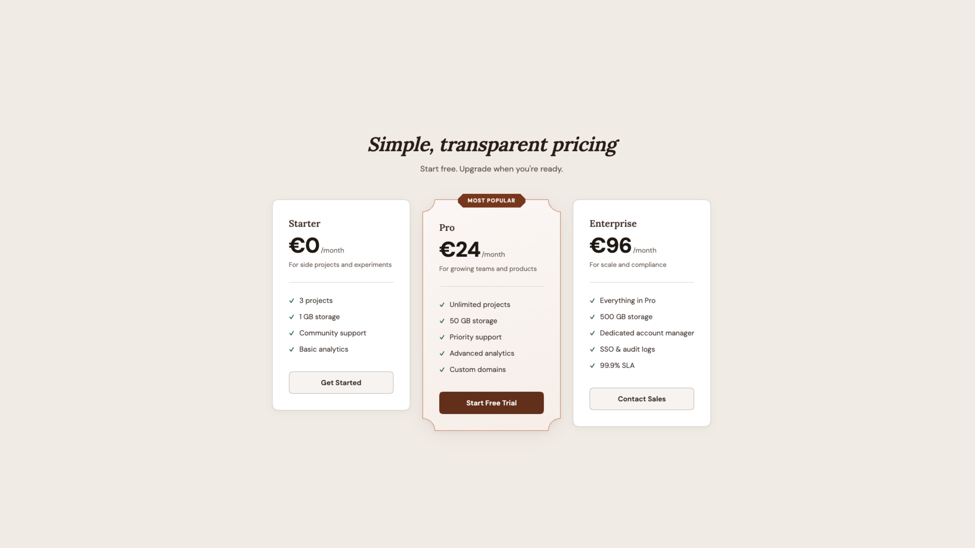
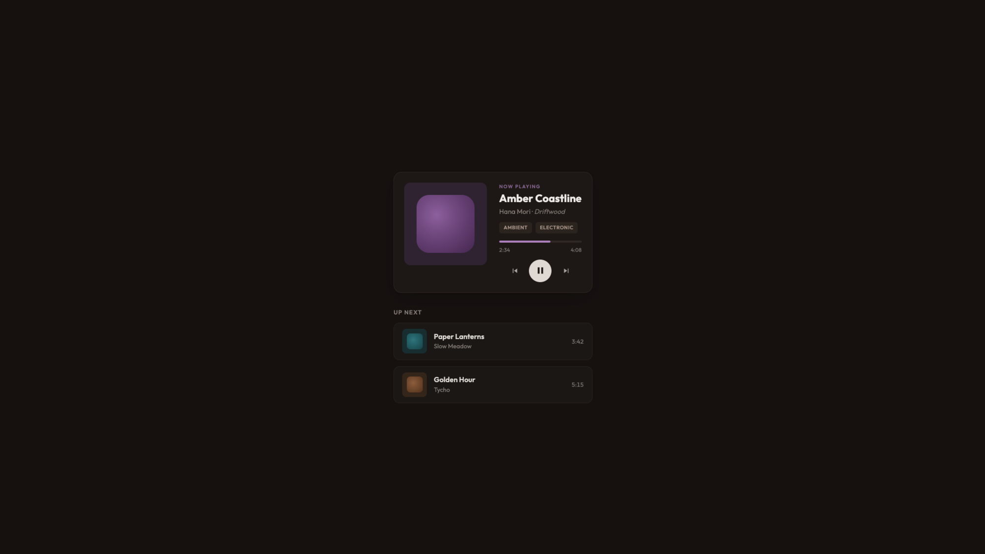
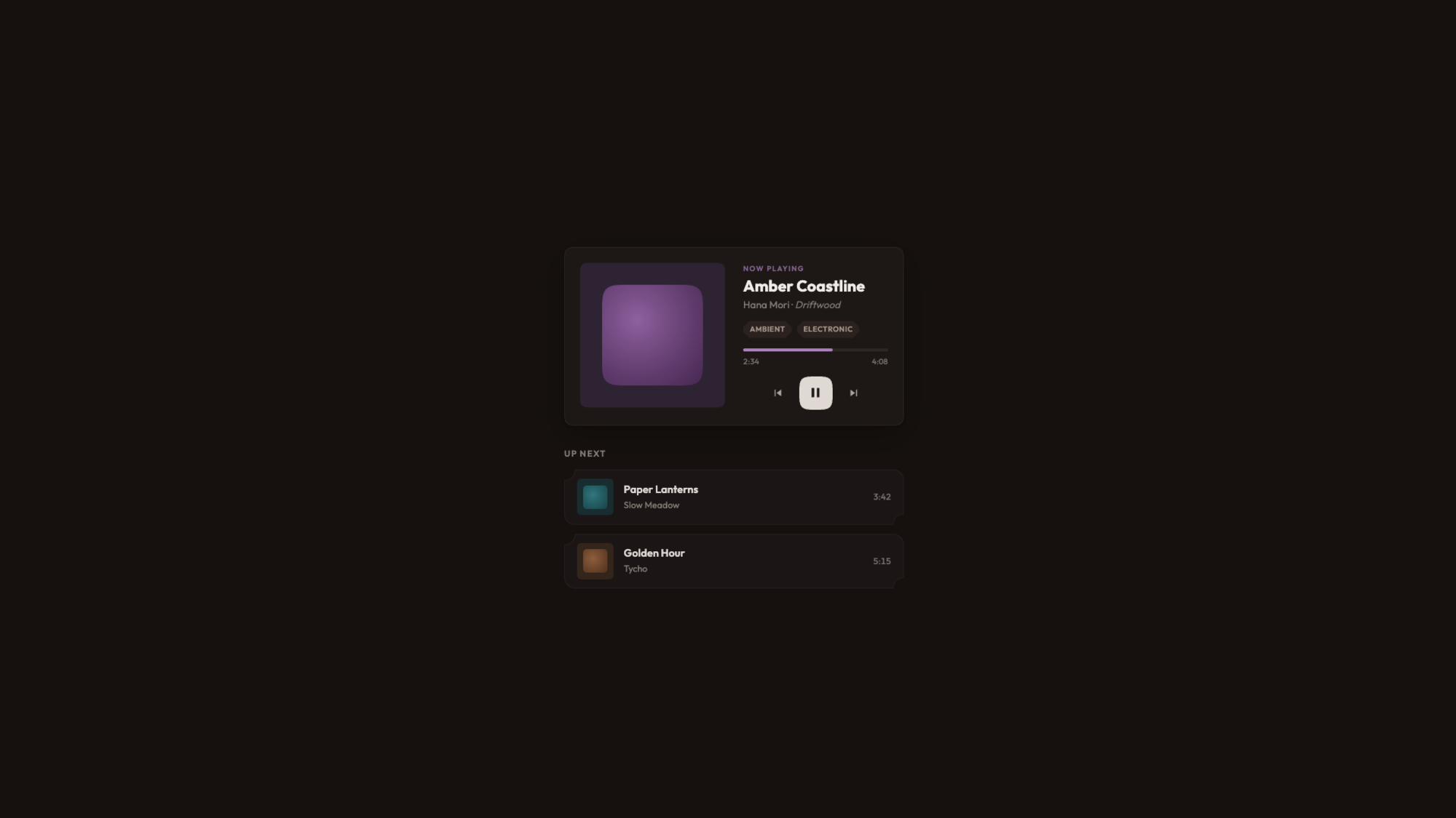
For years, developers have been hacking around the limitations of border-radius , using clip-path, SVG masks, and fragile workarounds just to get anything other than round corners. The new corner-shape property finally changes that, opening the door to beveled, scooped, and squircle corners.
When I first started building websites, rounded corners required five background images, one for each corner, one for the body, and a prayer that the client wouldn’t ask for a different radius. Then the border-radius property landed, and the entire web collectively sighed with relief. That was over fifteen years ago, and honestly, we’ve been riding that same wave ever since. Just as then, I hope that we can look at this feature as a progressive enhancement slowly making its way to other browsers.
I like a good border-radius like any other guy, but the fact is that it only gives us one shape. Round. That’s it. Want beveled corners? Clip-path. Scooped ticket edges? SVG mask.…