Menu

1 / 16

Designing Travel: The Zürich Card’s Flexible New Visual Identity

#webdesignerdepot#zurich#card#design#photo
Reading 0:00
15s threshold

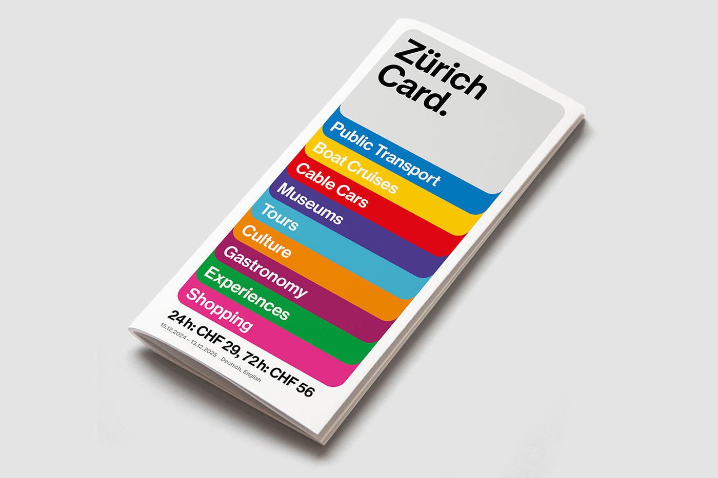
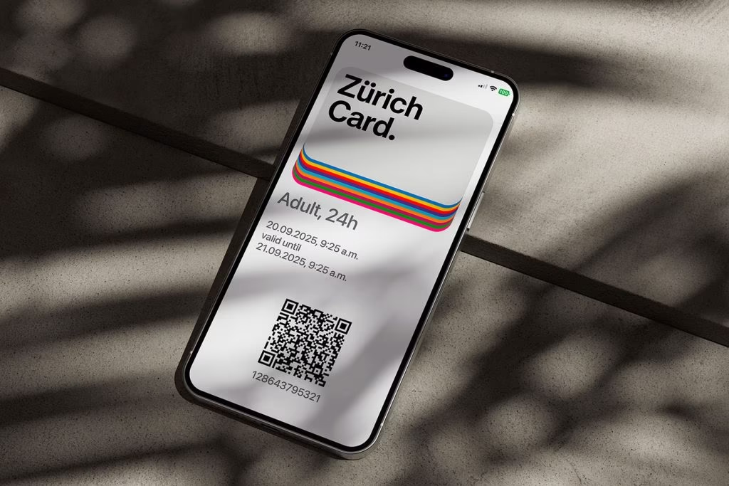
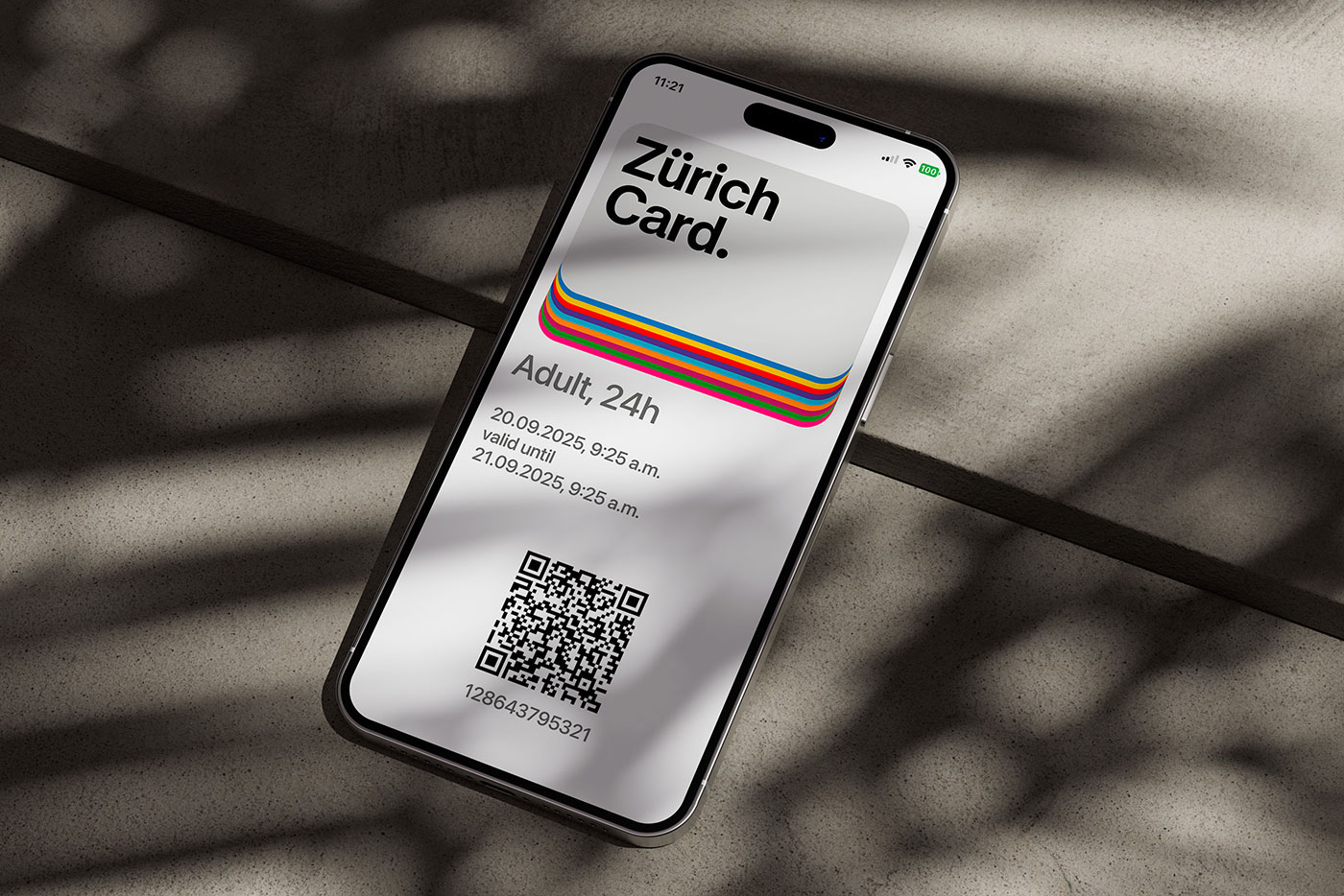
Most city passes look like something you’d shove in your wallet and forget about. The Zurich Card just got the opposite treatment—thanks to Studio Marcus Kraft , it now looks like a piece of design you actually want to show off.

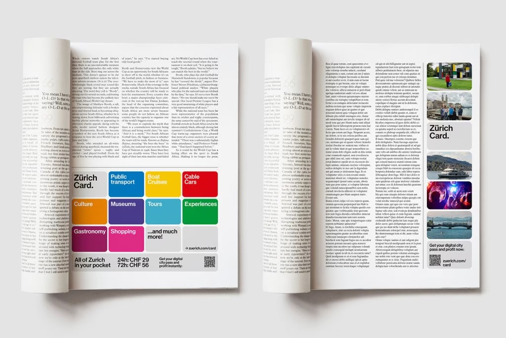
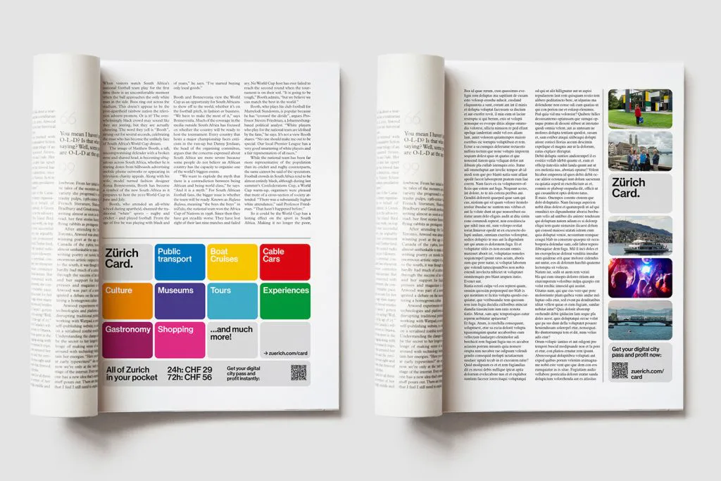
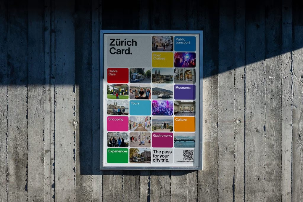
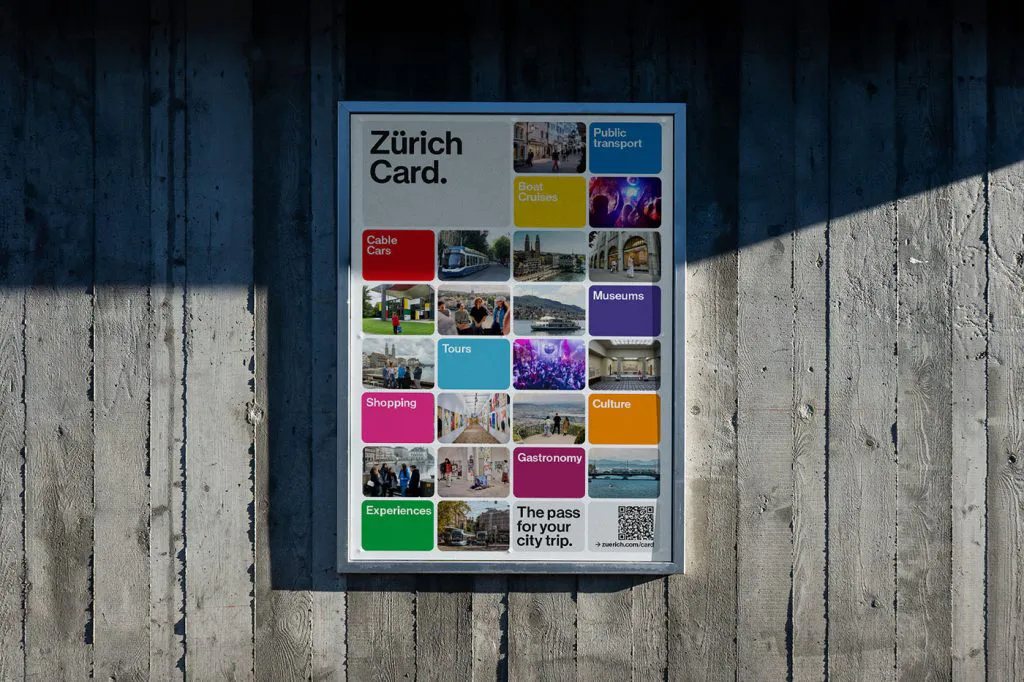
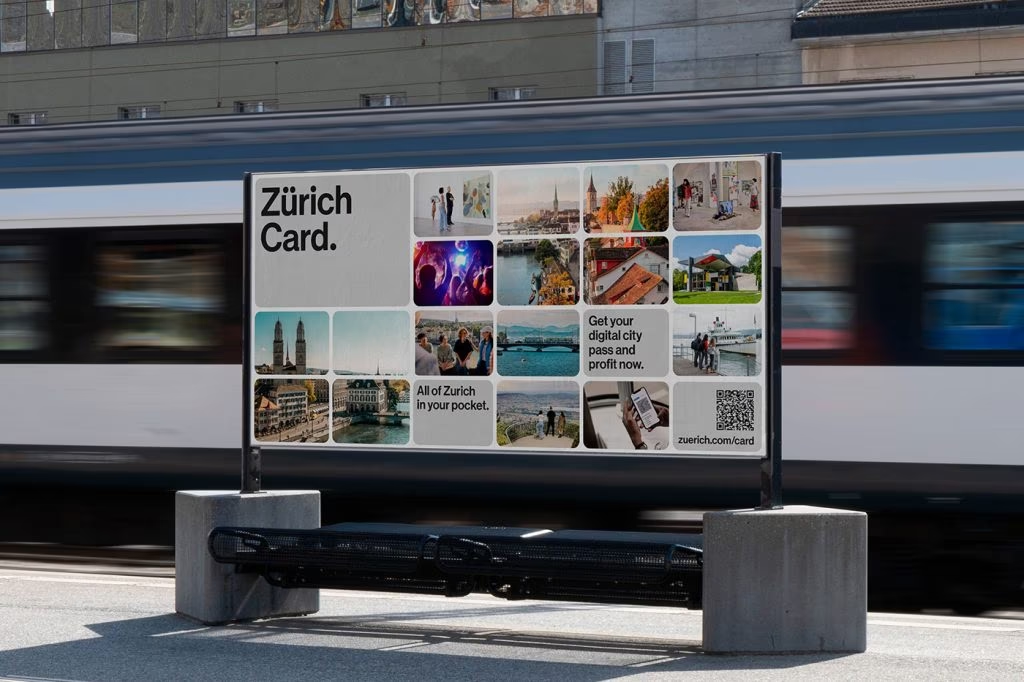
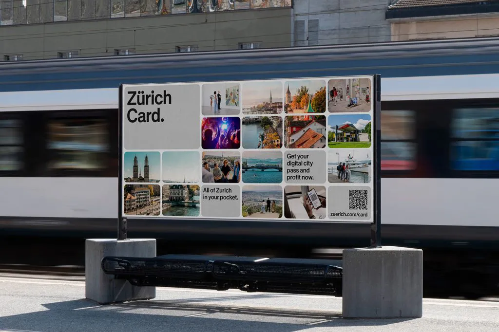
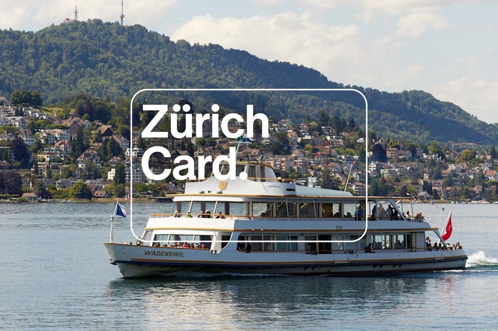
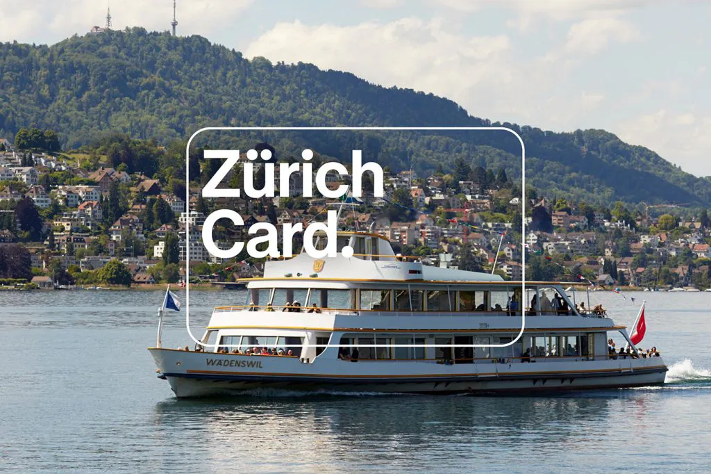
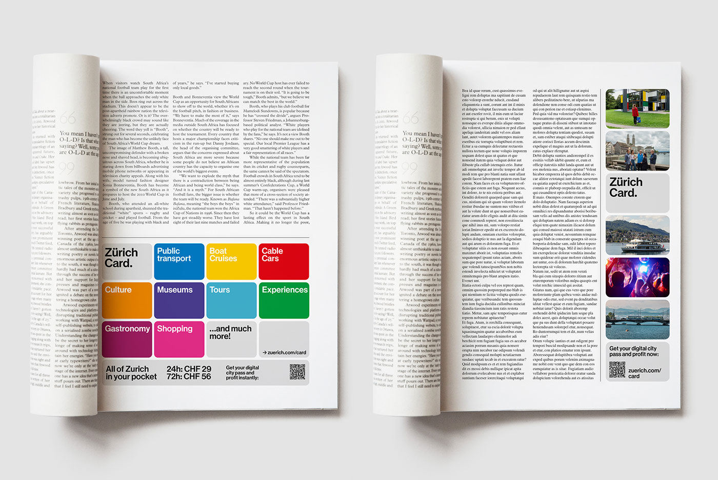
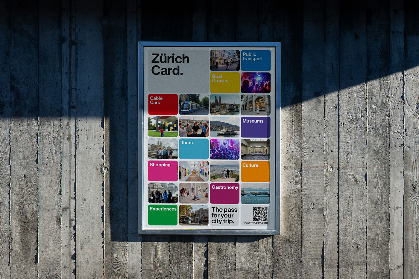
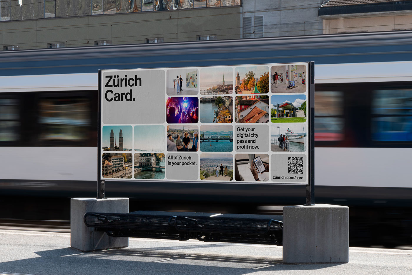
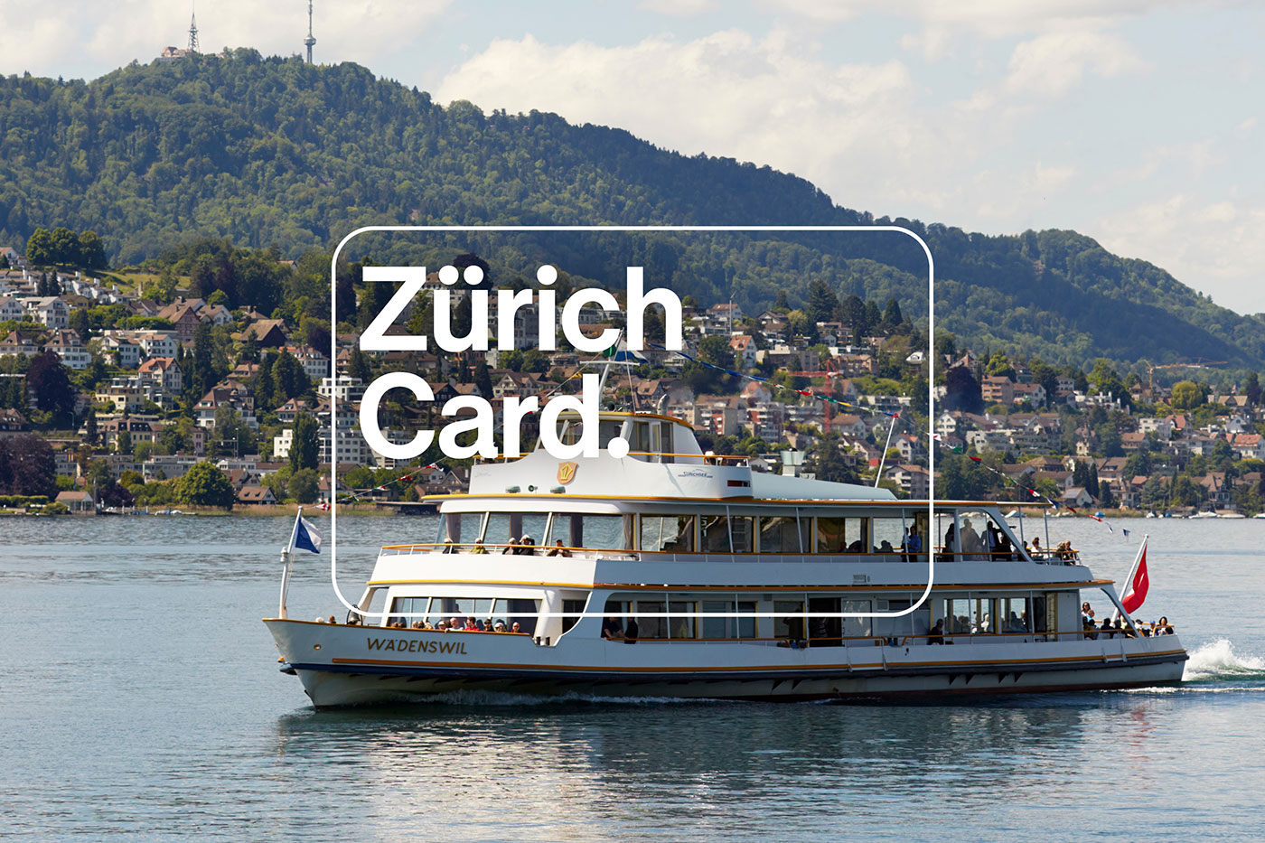
The redesign is built around a stylised card shape , and it’s surprisingly versatile. On one poster it frames a moody photo, on another it morphs into a mosaic of bright squares, and online it flexes into animations.

It’s not just a logo—it’s a design system with Swiss-level precision. Think grid logic meets emotional storytelling.

And yes, the typography is exactly what you’d hope for from Zurich.…

Continue reading — create a free account

Join HashtagPLUS to read full articles, follow hashtags, vote, and join the conversation.