Posted By Paul Kafasis on June 26th, 2026
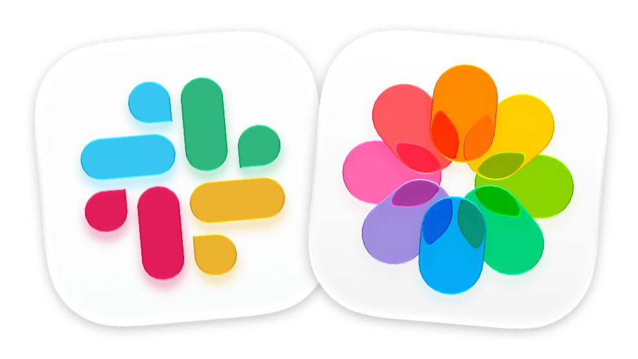
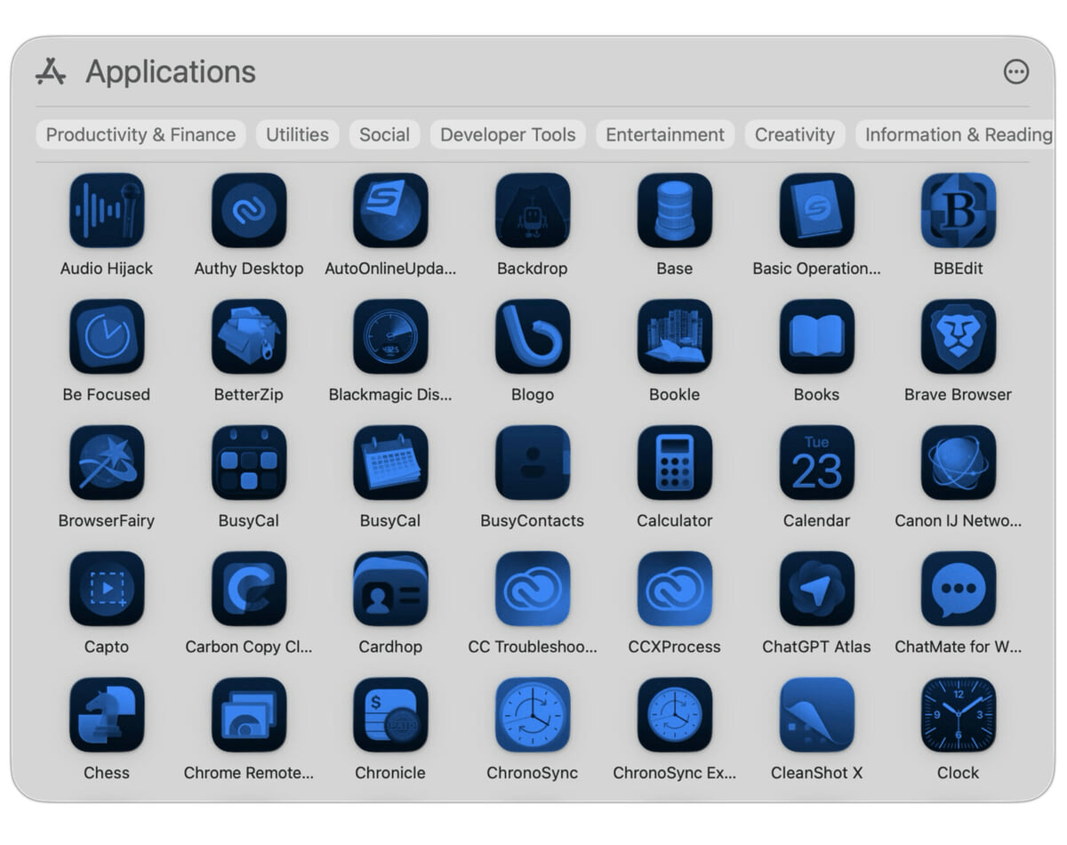
With last year’s release of MacOS 26 (Tahoe), Apple made a mess of app icons. In the first betas of MacOS 27 (Golden Gate), however, there are signs of a turnaround. We’re urging Apple to continue making improvements, by restoring the ability for MacOS app icons to have distinct shapes.
Apple’s Liquid Glass App Icons
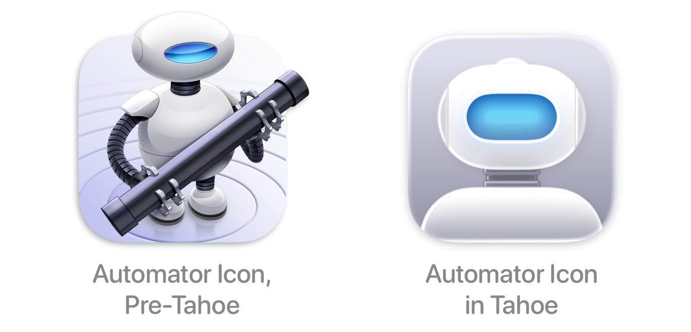
In Tahoe, Apple modified the icons for dozens of their first-party apps to give them a “Liquid Glass” appearance. The changes were a substantial regression, leading to blurry, dumbed-down icons .
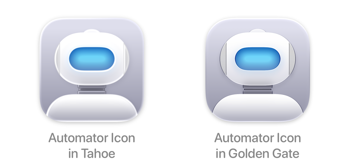
With the recently unveiled Golden Gate , Apple has again updated their MacOS app icons. This time, however, the changes are genuine improvements. Here’s the refined Automator icon, for example:
The newer icon is sharper, with superfluous Liquid Glass removed. Dozens of Apple’s apps have seen similar updates. The result is that Golden Gate’s icons are superior to Tahoe’s, as this comparison from Basic Apple Guy shows.…