Menu

Post image 1
Post image 2
Post image 3
Post image 4
Post image 5
Post image 6
Post image 7
Post image 8
Post image 9
Post image 10
Post image 11
Post image 12
Post image 13
Post image 14
Post image 15
Post image 16
Post image 17
Post image 18
Post image 19
Post image 20
Post image 21
Post image 22
Post image 23
Post image 24
Post image 25
Post image 26
Post image 27
Post image 28
Post image 29
Post image 30
Post image 31
Post image 32
Post image 33
Post image 34
Post image 35
Post image 36
Post image 37
Post image 38
Post image 39
Post image 40
Post image 41
Post image 42
Post image 43
Post image 44
Post image 45
Post image 46
Post image 47
Post image 48
Post image 49
Post image 50
Post image 51
Post image 52
Post image 53
Post image 54
Post image 55
Post image 56
Post image 57
Post image 58
Post image 59
Post image 60
Post image 61
Post image 62
Post image 63
Post image 64
Post image 65
Post image 66
Post image 67
Post image 68
Post image 69
1 / 69
0

Key symbols we lost to time, pt. 2: The Mac side – Unsung

Hacker News·1 day ago
#PZkoo9Fo
Reading 0:00
15s threshold

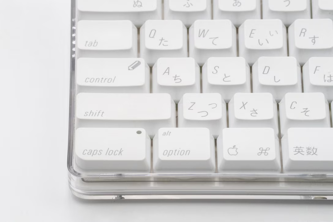
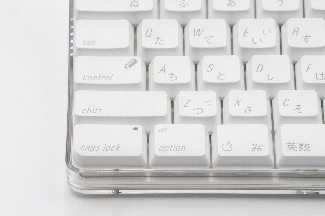
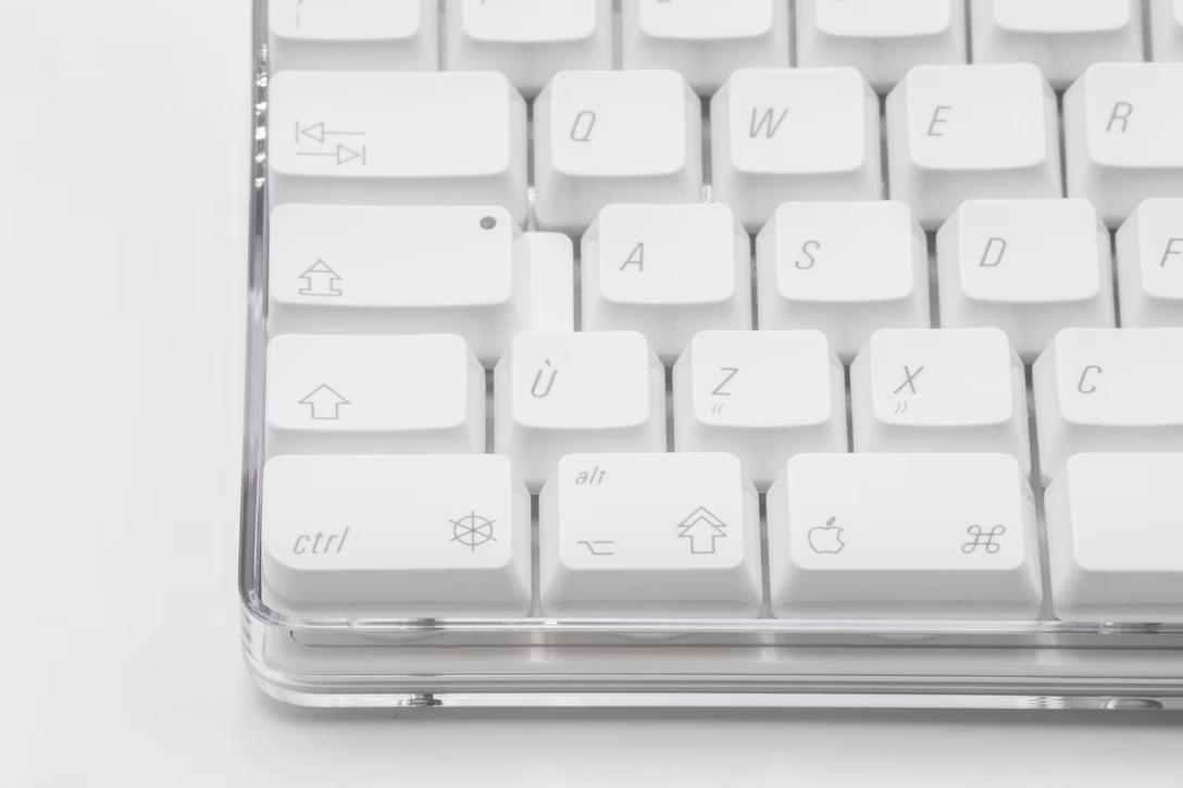
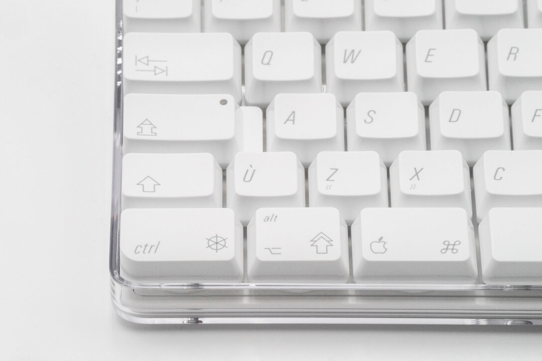
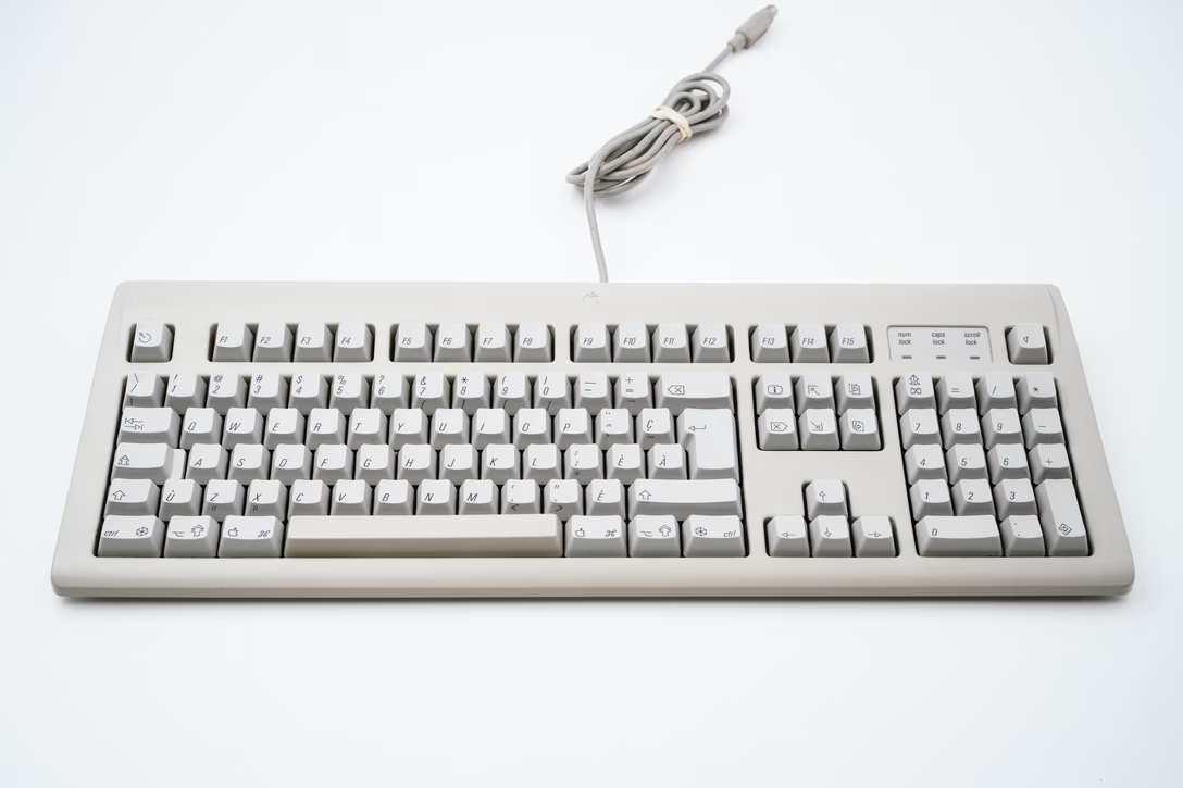
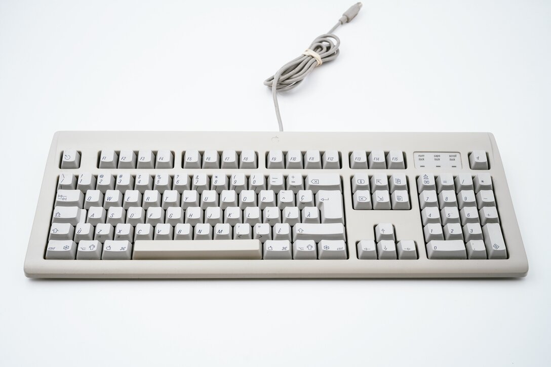
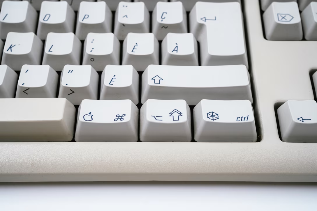
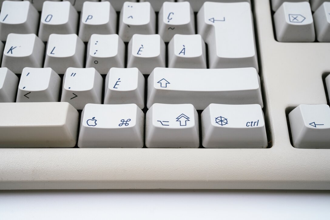
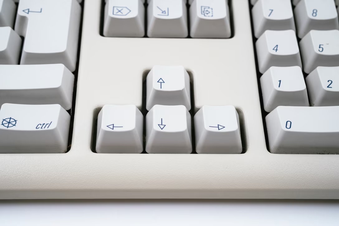
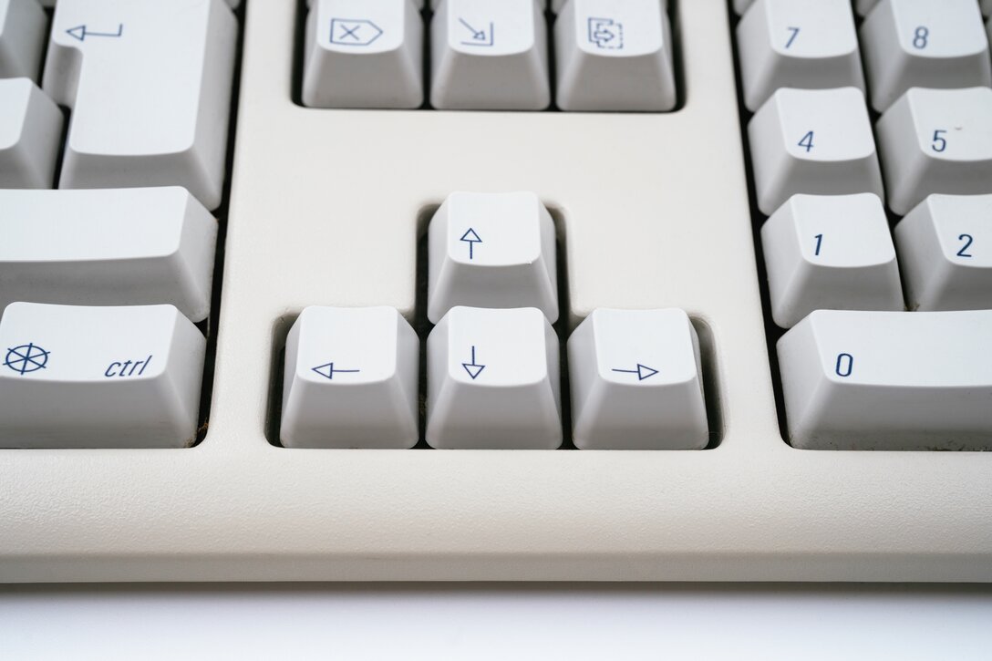
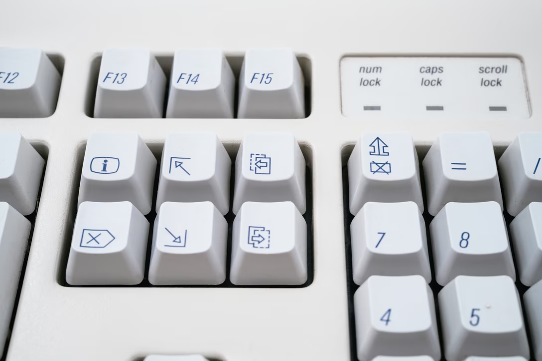
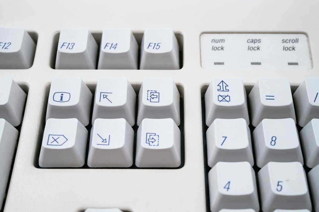
The relationship between keyboard manufacturers and standards bodies in various countries is so complex I barely understand a snippet of it. The most famous example must be the 1990s PowerBooks, which had a beige variant for Germany and Germany only, to conform with local laws that prescribed and enforced specific color and contrast combinations for keyboards, in order to avoid glare and attendant ergonomic problems for terminal operators in the decades before. (It wasn’t just Apple. ThinkPads did the same .) (I know. Jump scare!) But you’ll understand that what caught more of my attention was an obscure variant of keyboards for (parts of?) Canada in the late 1990s and early 2000s.…
Continue reading — create a free account

Join HashtagPLUS to read full articles, follow hashtags, vote, and join the conversation.

Read More