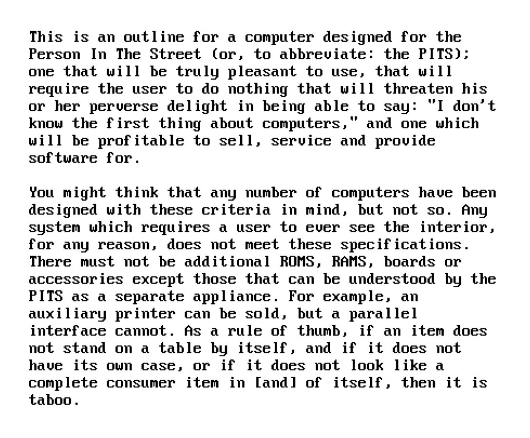
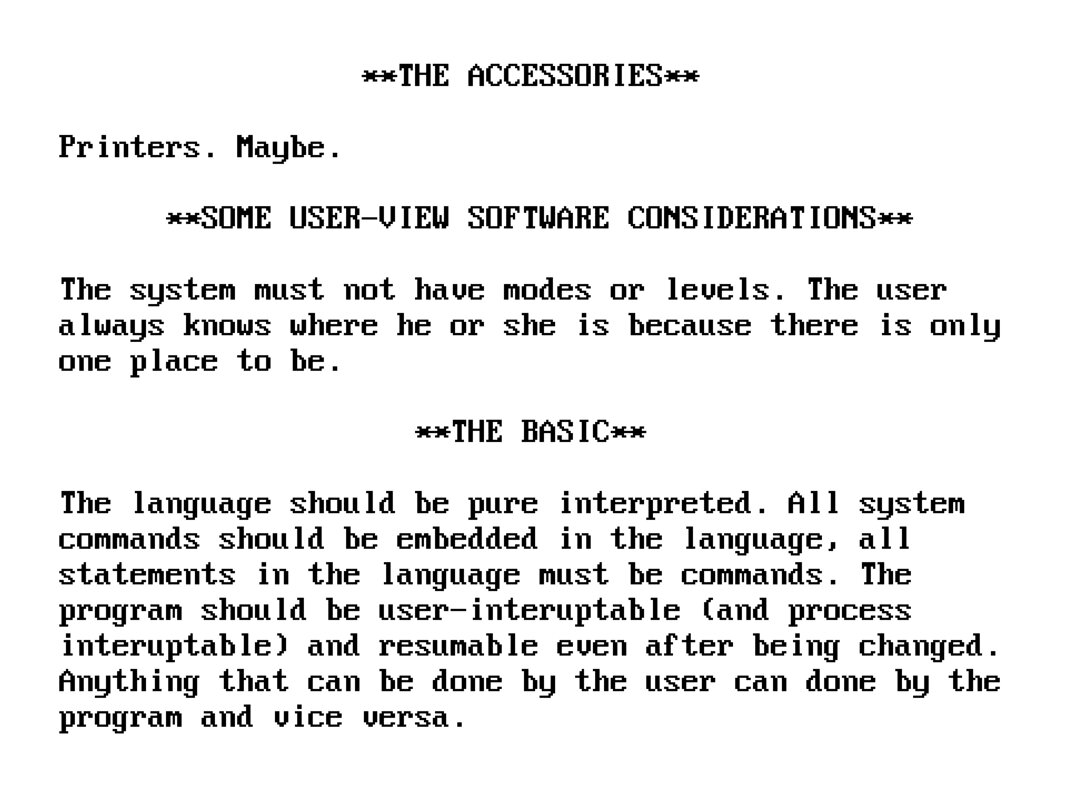
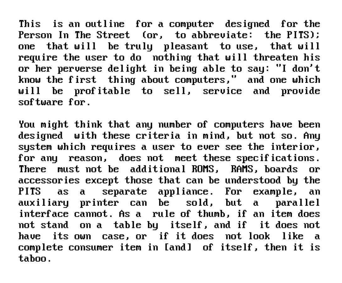
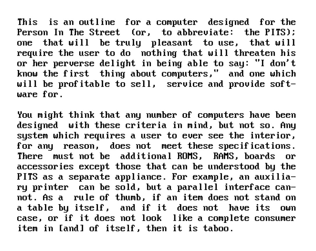
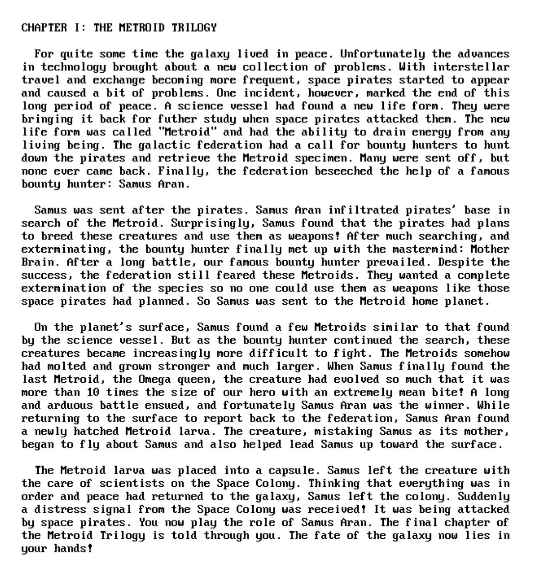
I don’t think anyone particularly enjoys typesetting in monospace. Regular text is okay – at least as okay as it can be: = 2x) and (width >= 700px)" srcset="https://unsung.aresluna.org/_media/i-just-chose-words-carefully/1.2096w.avif" type="image/avif"> = 3x) or (width >= 700px)" srcset="https://unsung.aresluna.org/_media/i-just-chose-words-carefully/1.1600w.avif" type="image/avif"> Right aligning is also fine, as long as you don’t mind counting spaces, but centering already gets tricky, as you don’t have a half space to make things truly even: = 2x) and (width >= 700px)" srcset="https://unsung.aresluna.org/_media/i-just-chose-words-carefully/2.2096w.avif" type="image/avif"> = 3x) or (width >= 700px)" srcset="https://unsung.aresluna.org/_media/i-just-chose-words-carefully/2.1600w.avif" type="image/avif"> And full justification is where things get particularly weird.…