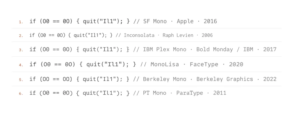
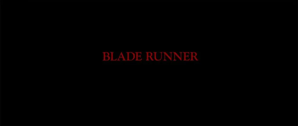
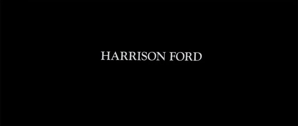
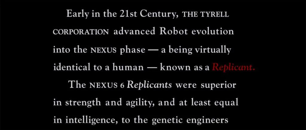
Appreciating typography is a study in paradox. The primary goal of well-designed typography is to help you read the words, not appreciate how the words are composed of letters and how each of those individual letters has been designed to convey a small bit of meaning. If you see the typography rather than read the words, the typography has failed in its job, right? You should be reading, not staring at the shape of that uppercase A. The goal with typography is functional, right? To convey the meaning, not the feeling? Wrong. Feeling is always conveyed. The question is, depending on the project, “How much feeling is required?” Fixed Width I’ve created a full-time job for myself talking to Claude Code. This is Claude running from the command line of macOS, which gives me unhindered access to my data. I’m using Ghostty. I’m staring at a fixed-width typeface all day.…