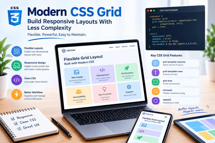
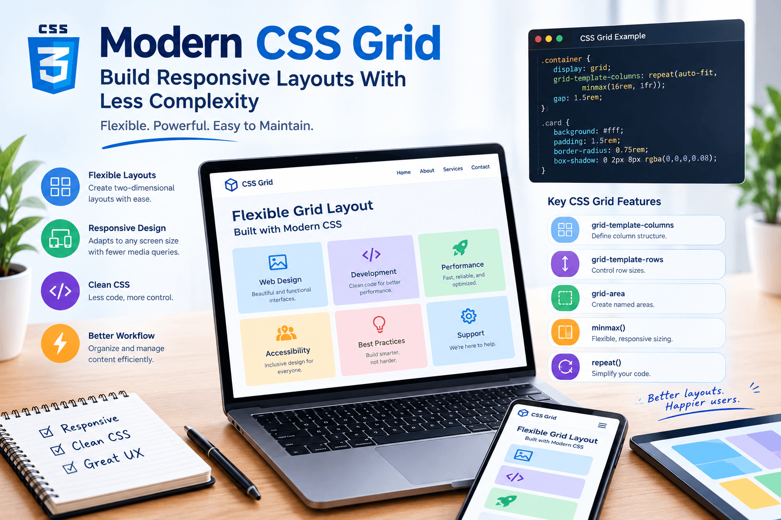
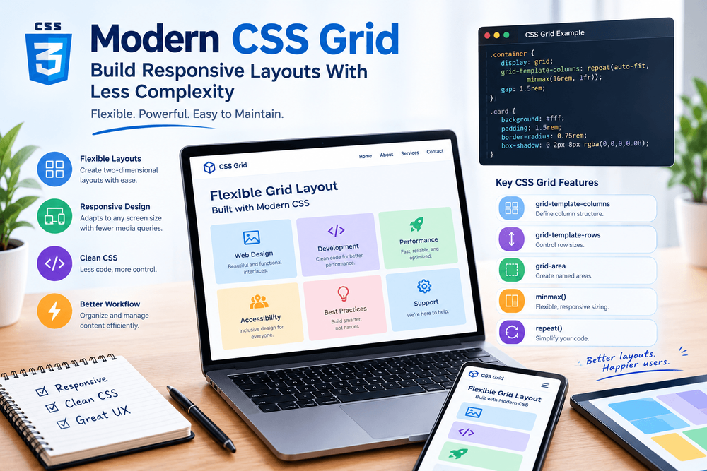
Creating responsive website layouts is a fundamental part of modern front-end development. Developers need interfaces that work across mobile phones, tablets, laptops, and large desktop displays without requiring separate markup for every screen size.
CSS Grid provides a powerful way to organize content into rows and columns. Unlike older layout techniques that often require additional wrappers or complicated positioning, Grid allows developers to define two-dimensional layouts directly in CSS.
When combined with flexible sizing functions, intrinsic layout techniques, and a small number of carefully chosen media queries, CSS Grid can make responsive interfaces easier to build and maintain.
This article explores practical CSS Grid techniques for creating flexible layouts, avoiding common mistakes, and writing cleaner responsive stylesheets.
1. Understand the Grid Container and Its Items
CSS Grid begins by defining a grid container.…