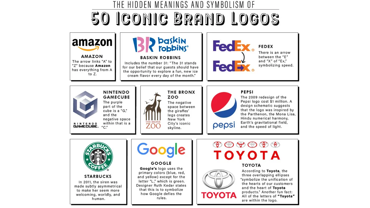
Gillette has finally confirmed its logo has a hidden meaning, which is something eagle eyed razor users have long suspected. We love secret design elements when applied cleverly to logos – not only do they bring a fun talking point, but they also deepen consumer connection to a brand with the attention to detail.
The design detail hiding inside the Gillette logo is completely true to the brand's core product – it's a razor blade, sitting inside the wordmark itself – and the Gillette social media team confirmed it on Instagram this week. Take a look below and see if you think it qualifies the design for our best logos ever list.
Designers and consumers are delighted in the comments, with praise for the design team.…