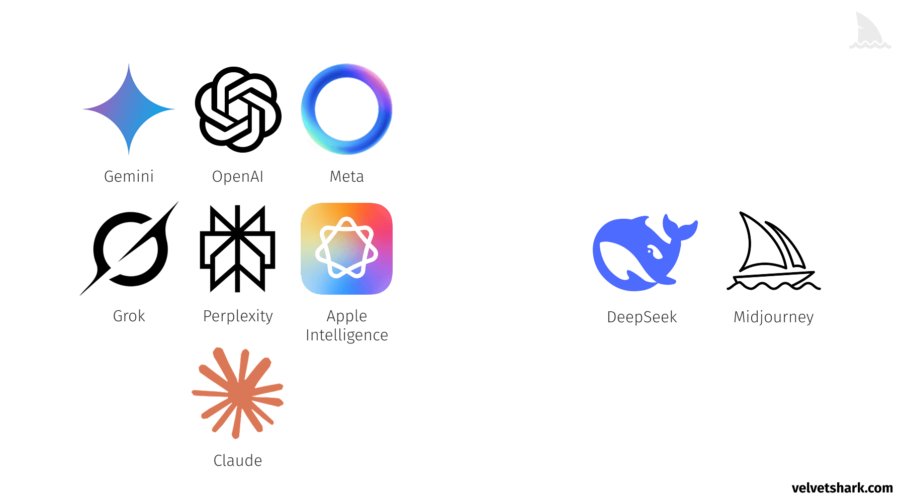
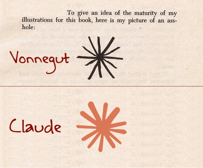
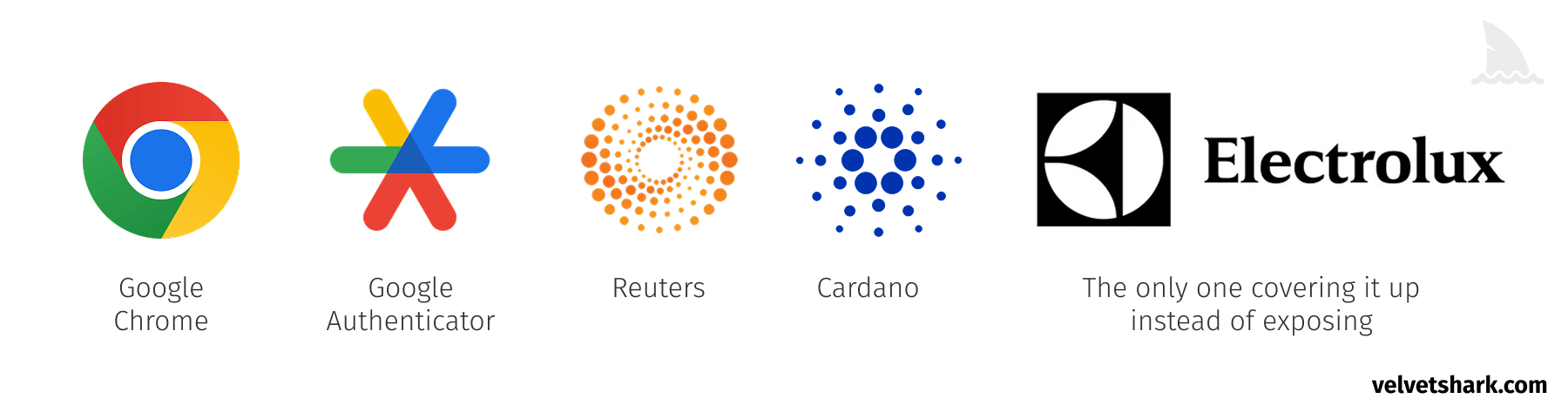
If you pay attention to AI company branding, you'll notice a pattern: Circular shape (often with a gradient) Central opening or focal point Radiating elements from the center Soft, organic curves Sound familiar? It should, because it's also an apt description of... well, you know. A butthole. The circular AI logo epidemic If you ever thought that AI company logos look like buttholes, you're not alone. FastCompany noticed this trend in 2023 and published an article about it, but (I could only presume) their editors and lawyers didn't let them title the article the way the wanted it to title, so it got published with a more safe for work title: The AI boom is creating a new logo trend: the swirling hexagon . They also were careful not to mention anything anatomical. I don't have editors or lawyers, so let's take a closer look at some examples: OpenAI's logo evolution OpenAI's original logo was a simple, text-based mark. Then came the redesign: a perfect circle with a subtle gradient and central void.…