advertisement
BY Nicole Gull McElroy
Listen to this ArticleMore info 0:00 / 0:00
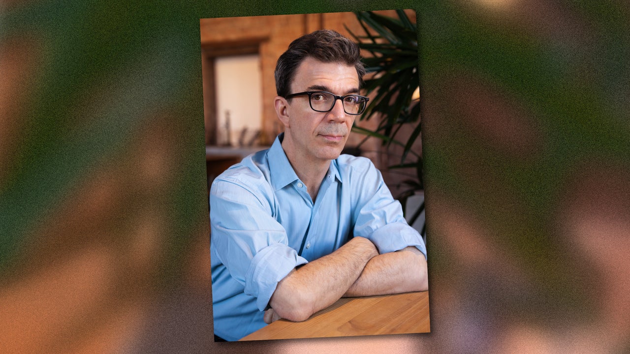
Tobias Frere-Jones has designed typefaces for clients like Martha Stewart Living , the New York City Metropolitan Transportation Authority, Carnegie Hall, Stacey Abrams, Barack Obama’s 2008 campaign, Zohran Mamdani’s mayoral office, the American Civil Liberties Union, New York City Football Club, and many more. Years ago, a friend of his asked him what he thought what letters are made of. Frere-Jones’s answer came quickly and in a single word: negotiation.
As a culture, we agree that letters take a certain shape and carry specific meaning, says Frere-Jones.…