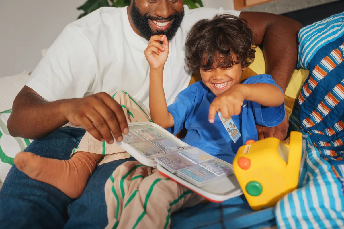
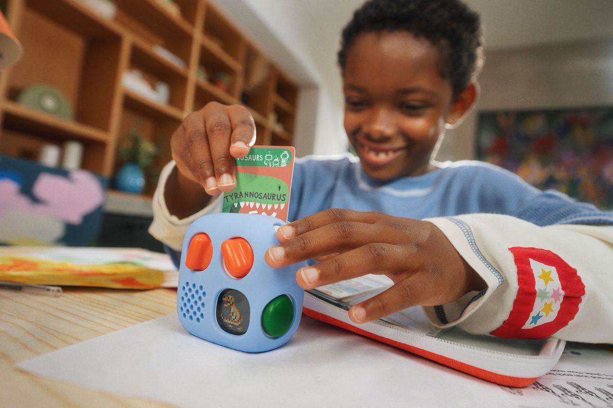
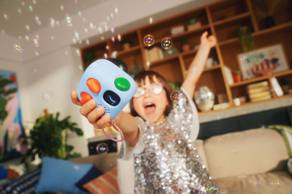
(Image credit: Yoto)
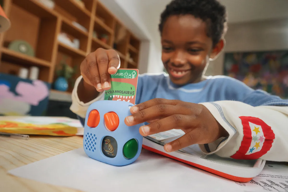
I’ve been obsessed with Yoto since 2019, when a friend introduced me to the tactile, lo-fi audio player for kids. My children have used it daily ever since , and it’s one of the most interesting brands out there. It arrived just as parents were looking for an alternative to endless high-stimulation screens, and it has grown from a community-led, Kickstarter-style product with its foibles into a polished, self-assured brand that still listens closely to its community.
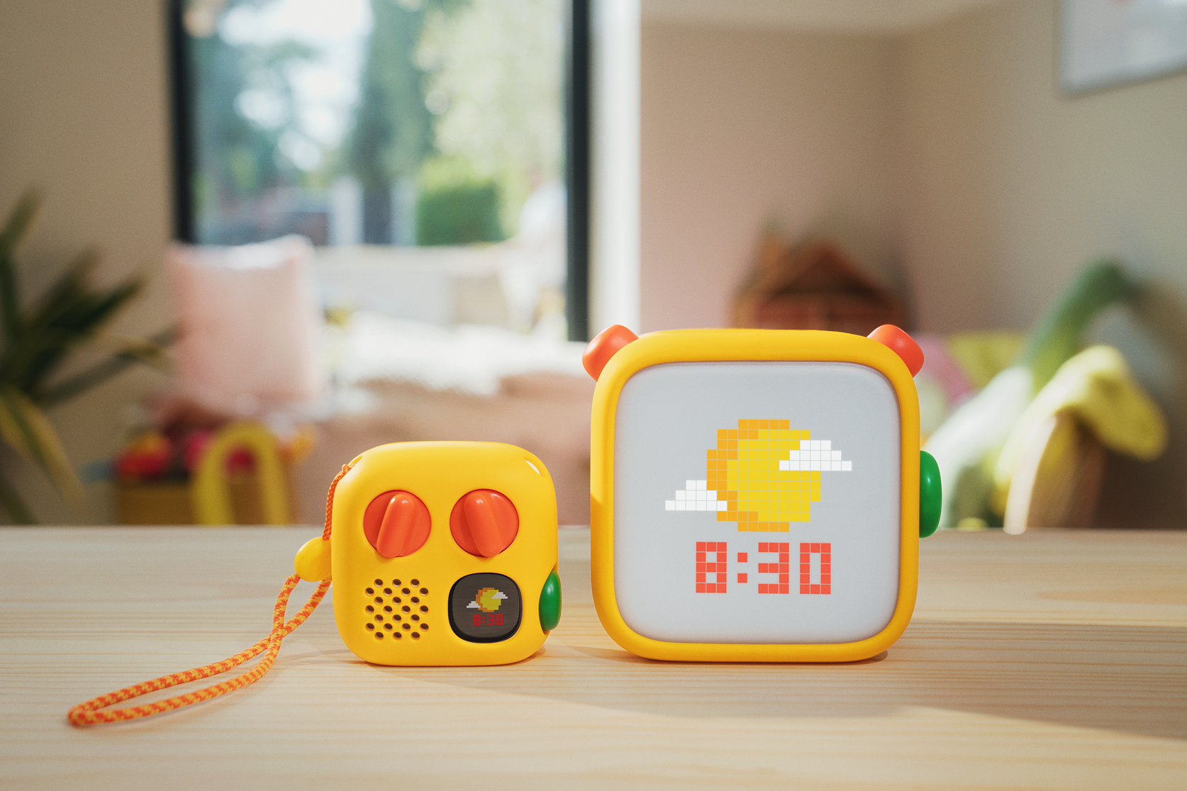
So when I heard a new generation was on its way, I asked to speak to the design team behind the biggest shake-up of its physical design yet. It’s a fairly tricky proposition: a product used by children but invested in by parents, with a clear mission and a feature set that’s still evolving. The new players have a mischievous new look, a green dial (big news in the world of Yoto) and a few other added features. Most importantly, the design team and Yoto chose not to lean any harder on the screen’s capabilities.…