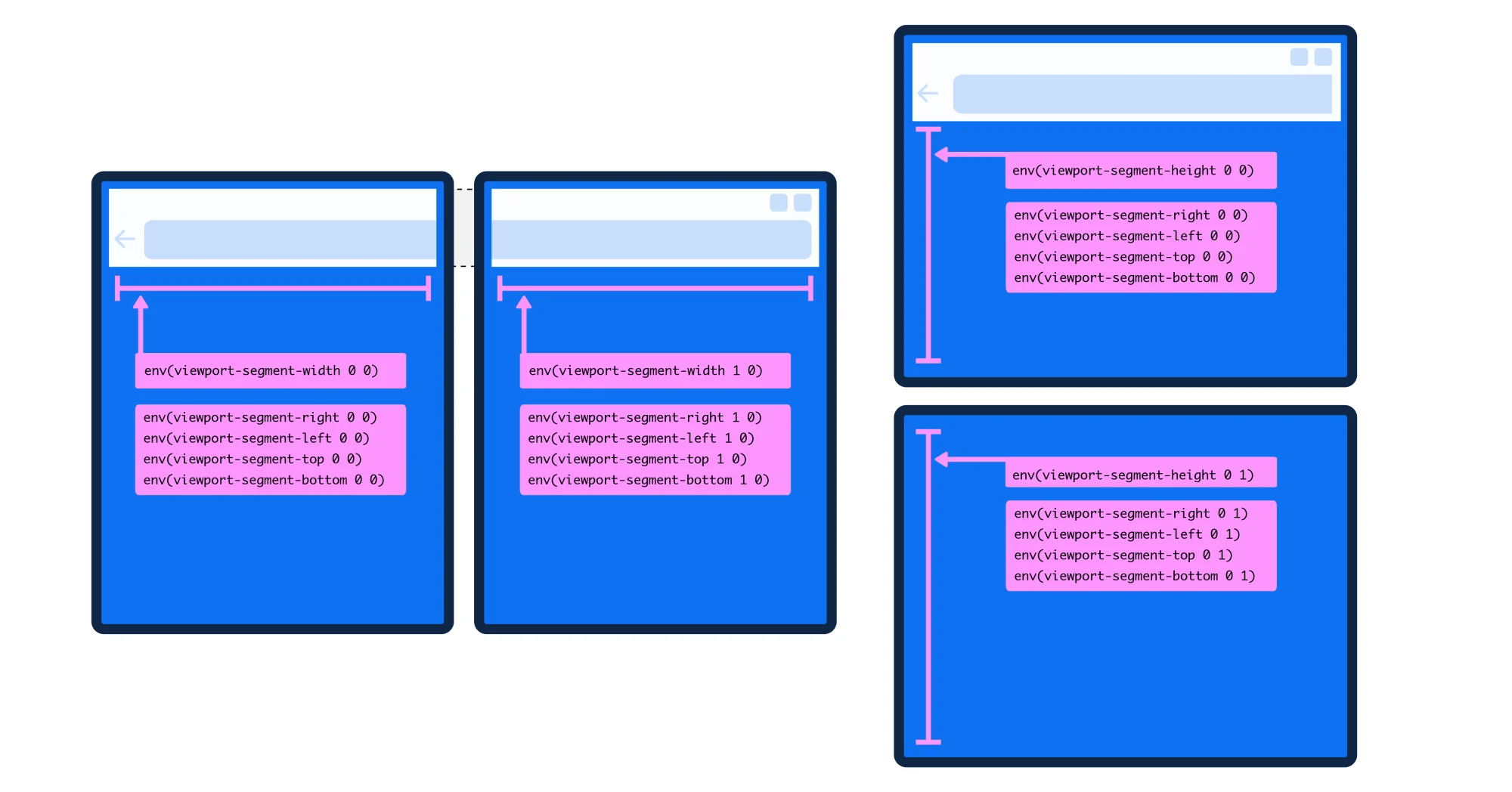
With the announcement of Google's Pixel Fold , I thought its an apt time to revisit what technologies are available for designing and developing experiences that adapt to a foldable device. Let's ignore the naysayers who vehemently don't want to design for a new form factor, while also ignoring the price of Goggle's first generation device and just focus on what's possible right now. There are two media queries for targeting your foldable device. @media (horizontal-viewport-segments: <count>) { } @media (vertical-viewport-segments: <count>) { } The horizontal-viewport-segments query targets the device when it is being held like a book and the two screens are side-by-side. And vertical-viewport-segments targets the device when the two screens are stacked on top of each other and fold like a laptop. I've found this mode useful when using my Surface Duo with PowerPoint. I can access my speaker notes on the bottom screen and my presentation is on the top screen. Pretty snazzy.…