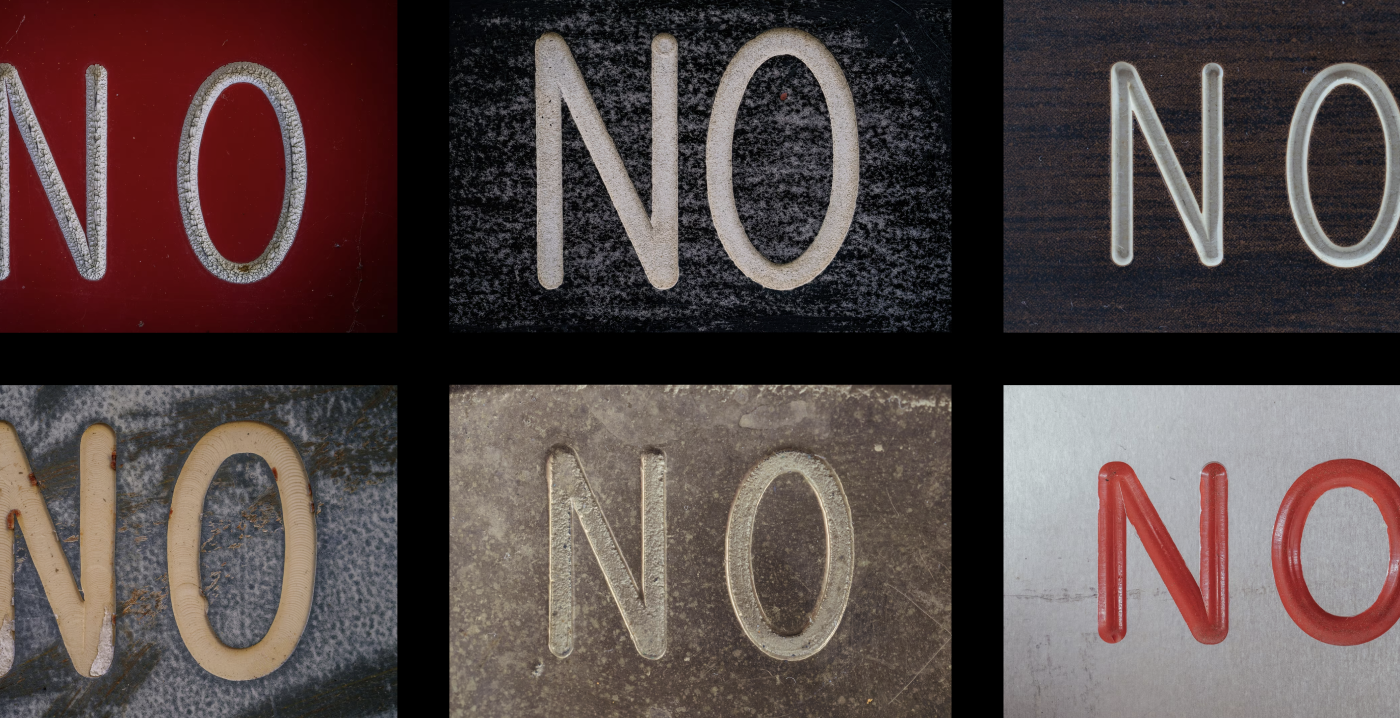
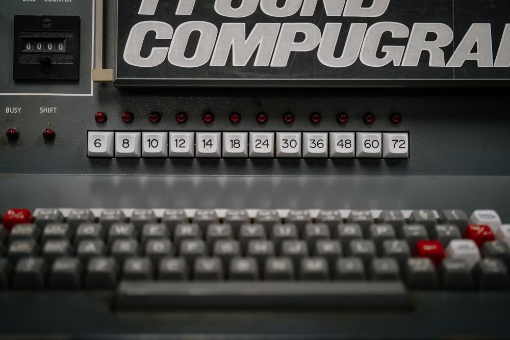
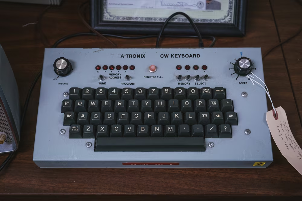
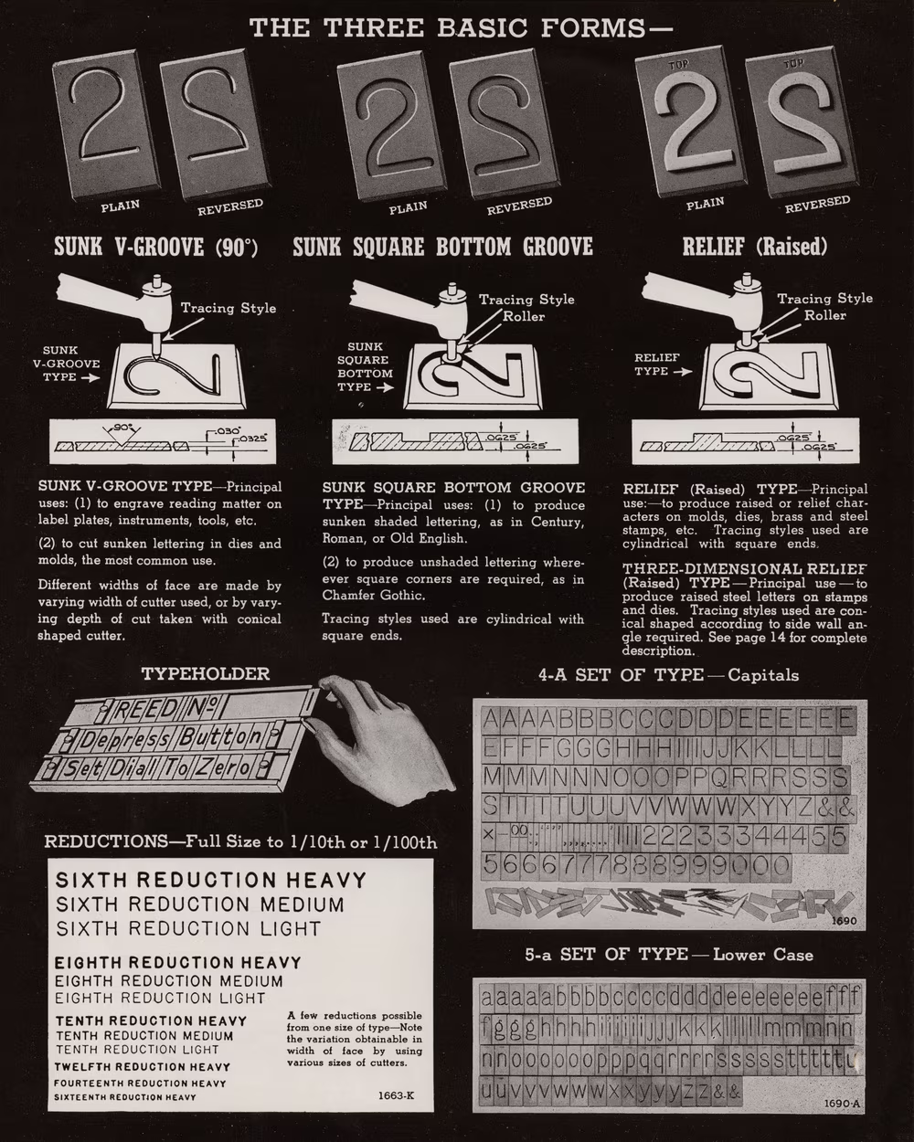
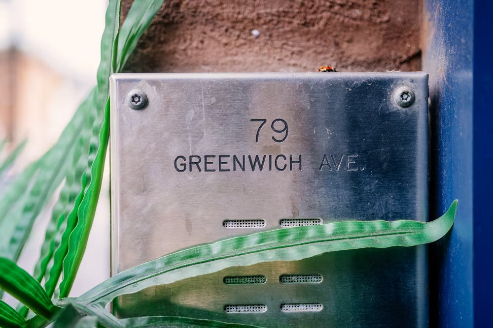
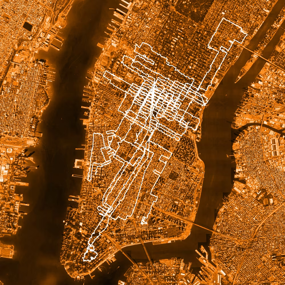
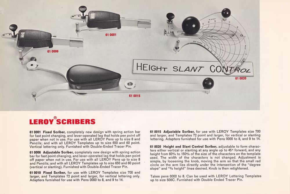
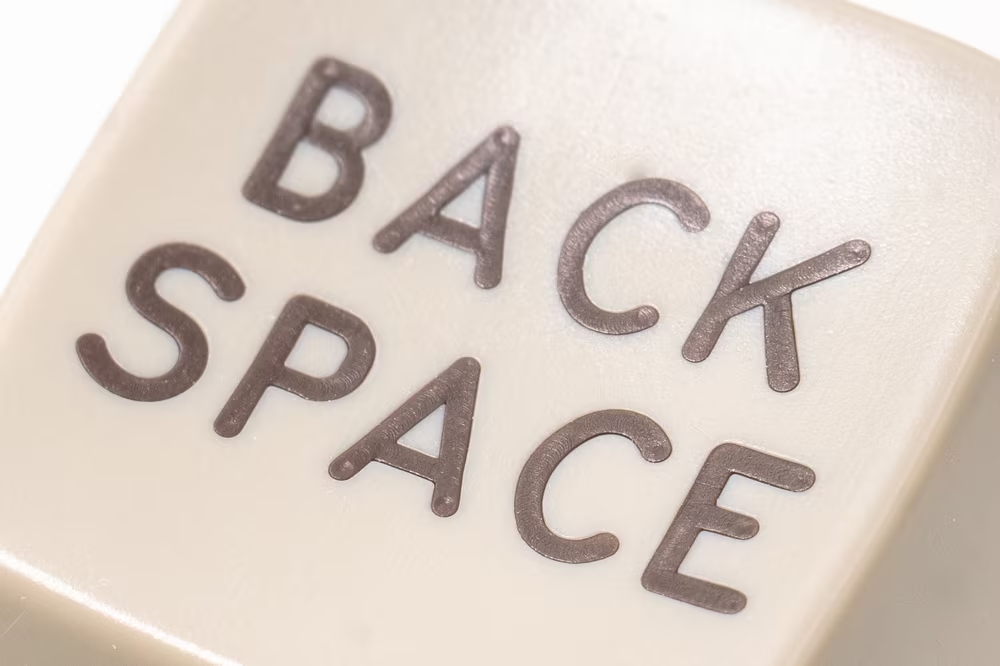
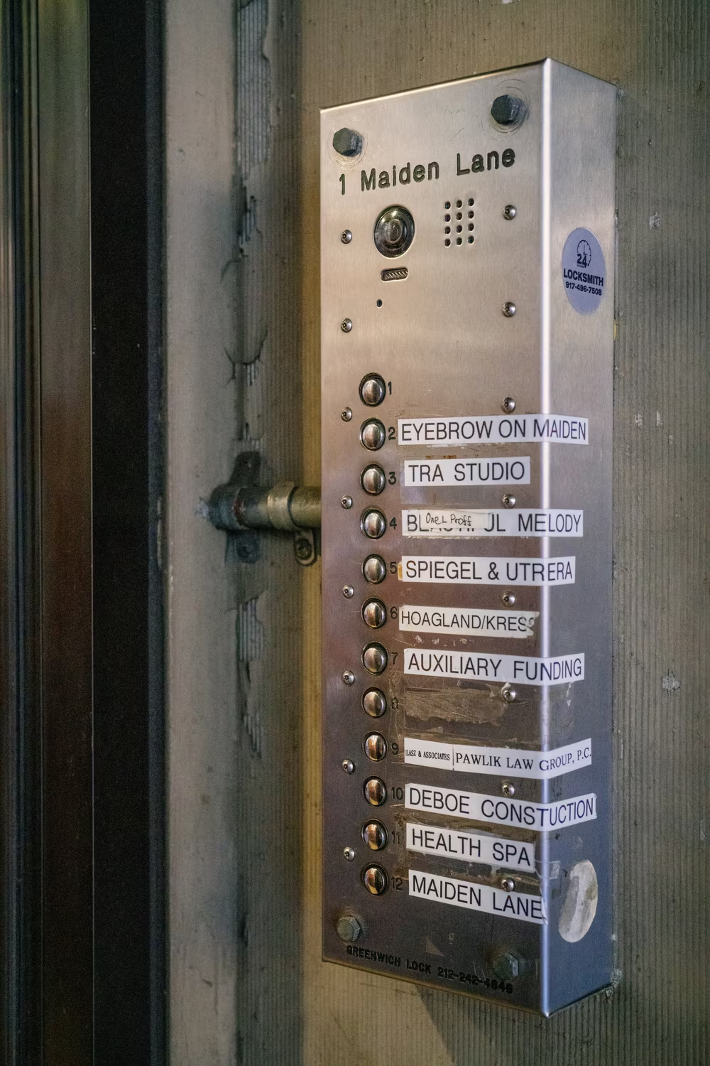
Marcin Wichary 14 February 2025 / 6,100 words / 600 photos In 2007, on my first trip to New York City, I grabbed a brand-new DSLR camera and photographed all the fonts I was supposed to love. I admired American Typewriter in all of the I <3 NYC logos, watched Akzidenz Grotesk and Helvetica fighting over the subway signs, and even caught an occasional appearance of the flawlessly-named Gotham, still a year before it skyrocketed in popularity via Barack Obama’s first campaign. But there was one font I didn’t even notice, even though it was everywhere around me. Last year in New York, I walked over 100 miles and took thousands of photos of one and one font only. The font’s name is Gorton. 1 It’s hard to believe today that there was a time before I knew of Gorton and all its quirks and mysteries. The first time I realized the font even existed was some time in 2017, when I was researching for my book about the history of typing .…