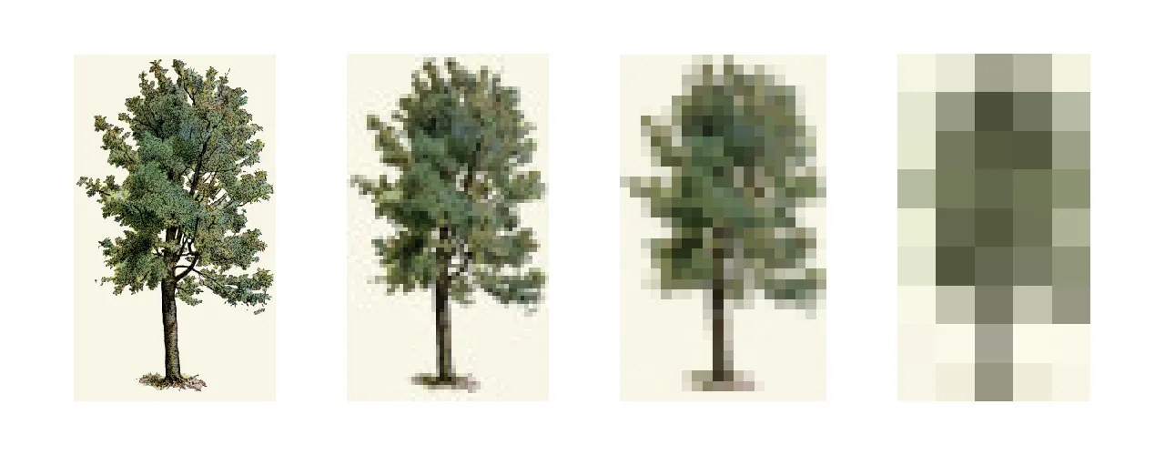
What looked like a rendering bug turned out to be a clever JPEG decoding optimization in Chrome. This icon looks better on my colleague’s computer A while back, when chatting with a colleague over their computer, I noticed that a logo did not look exactly the same as it did on mine. It looked thinner on theirs and more faithful to the original image. It was rendered at 15px; here is an upscaled version. Note: this was not the original image. It happened a while ago, so I made a new image to demonstrate the issue. On the left, Firefox; on the right, Chrome. If you squint, or take a step back, the one from Chrome looks thicker. A bit weird, but swapping the image for an SVG fixed it. Still, I was curious: why was it rendering like this in the first place? I did some digging and found a nifty optimization that Chrome uses when rendering JPEGs at small scales. Scaling down images can be wasteful The intuitive way to render a small image from a JPEG is to fully decompress it in memory and then scale it down.…