The weird 'war on woke' being waged in the US has already claimed some high-profile design victims. The most famous examples have been the Cracker Barrel rebrand , which was deemed too modern for conservatives, and the US State Department's use of the famously liberal typeface Calibri.
Several brands have held their nerve in the face of the onslaught. Mars refused to entertain Tucker Carlson's fetish for the green M&M , the Jaguar rebrand is starting to make sense, and Bob's Red Mill seems to be sticking to its decision to 'kill off' Bob.
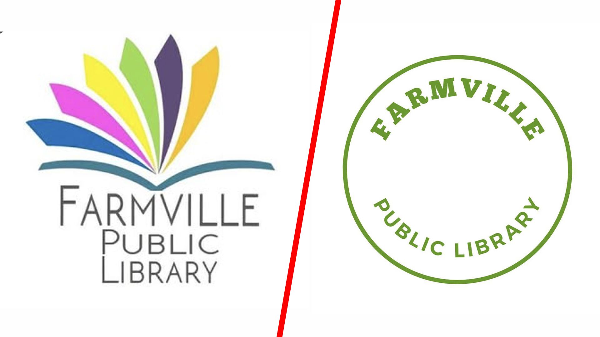
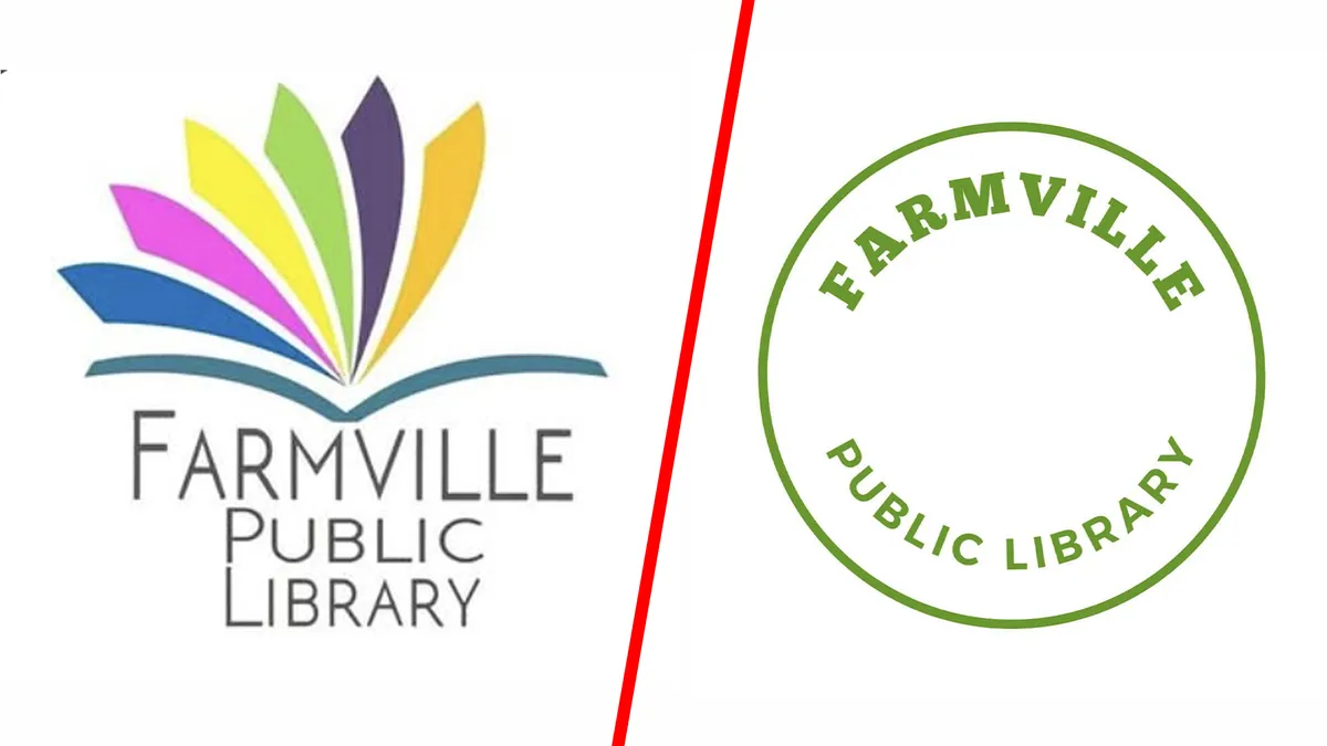
Alas, it seems a library in North Carolina didn't have such guts. Farmville Public Library has reportedly ditched the logo design it had been using for the past 14 years because three people complained that it looked a little bit like a rainbow, which apparently reminded them of gay people.
THESE PEOPLE HAVE LOST THEIR MINDS!!! For 14 years, the Farmville Public Library's logo was an open book with each page in a different color. Now it's gone.…