Jump to Docs Navigation
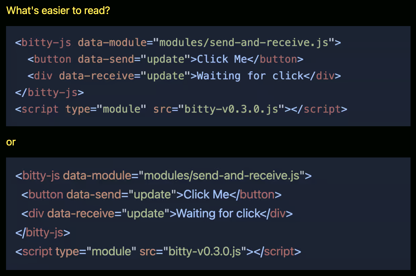
I like how Alan questions something nearly all of us take for granted: What if We Used Proportional Fonts for Code Blocks? And he kinda leaves it at that. What if.
Lots of text is almost certainly easier to read in a non-monospace font, but is lots of code easier to read? And spaces/tabs are the same width, so we’d still get consistent indentation on the left, correct? Things would just stop lining up as the characters in subsequent lines differed.
I’m intrigued by it, but admit I’ve never tried it. Nor is it available on CodePen yet. But I wouldn’t rule it out. CodePen can be about experimentation. We do offer some pretty out-there choices like Comic Code and Monaspace Radon , which feel way nicer than you’d think using full-time (but are still monospace).…