October 27, 2026 •
A growing trend in ecommerce design is to color the entire product page to match the item for sale.
It’s a bad, bad UX.
Human beings want to get from point A to point B as easily as possible. Speed bumps force us to spend brain energy, and that’s draining, even for online purchases.
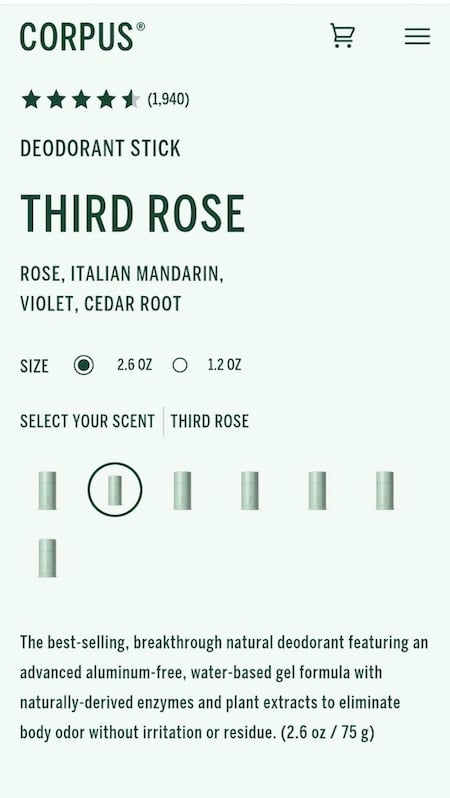
Imagine you’ve heard about a natural deodorant brand. You’re excited to try it, and get to this screen on your phone:
How to tell one scent from the other?
You think, “It’s all green here. And all the scents look the same, with no indication of what they are. Do I have to click each of them? Maybe it’s just my mobile . Let me look on my laptop.”
The wider screen version is actually worse.
On desktop, only the product name and image stand out.
It’s all green, matching the product package color.
The scent variations are still small and look the same. You indeed have to click them all.
Only the product name and image stand out. There’s no visual indication for links.…